קמרינו חצי קורסיביCamerino Semi-CursiveCamerino Semicorsivo
מחקר הכתב והאותיותA Study of the Script and LetterformsUno studio della scrittura e delle lettere
לגלולScrollScorri
מחקר הכתב והאותיותA Study of the Script and LetterformsUno studio della scrittura e delle lettere
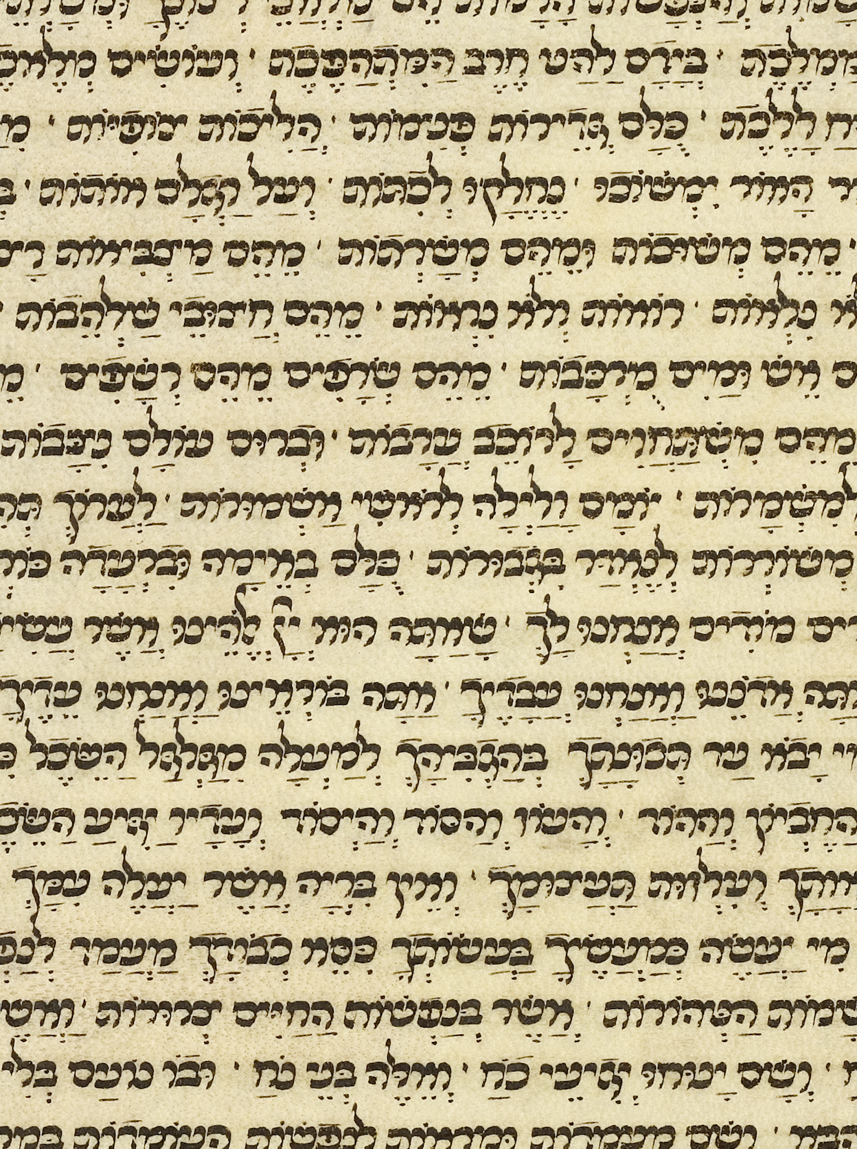
במהלך המאה השלוש עשרה החלו להתגבש באירופה שלוש מסורות כתיבה עבריות מרכזיות, אשכנזית, ספרדית ואיטלקית. באיטליה התפתח כתב רהוט וגמיש ששימש להעתקת פירושים, ספרי הלכה, הוראות וספרי תפילה, ונודע בשם כתב חצי קורסיבי איטלקי.During the thirteenth century, three major Hebrew scribal traditions began to take shape across Europe: Ashkenazi, Sephardi, and Italian. In Italy, a fluent and flexible script developed for copying commentaries, halakhic texts, instructional works, and prayer books, known as the Italian semi-cursive script.Nel corso del tredicesimo secolo, in Europa cominciarono a delinearsi tre grandi tradizioni scribali ebraiche: ashkenazita, sefardita e italiana. In Italia si sviluppò una scrittura scorrevole e flessibile, usata per copiare commentari, testi halakhici, opere didattiche e libri di preghiera, nota come scrittura semicorsiva italiana.
בניגוד לכתב המרובע, שהיה יציב וטקסי, הכתב החצי קורסיבי אפשר תנועה מהירה וחופשית יותר. האותיות קיבלו קימורים רכים, פתחים רחבים וזרימה אורגנית. למרות מראהו החופשי, זהו כתב מקצועי ומגובש, בעל כללים ברורים ומסורת שנשמרה בידי סופרים מיומנים.Unlike the square script, which was formal and ceremonial, the semi-cursive allowed for faster, freer movement of the hand. Its letters took on soft curves, wide openings, and an organic flow. Despite its loose appearance, it remained a professional, well-defined script, governed by clear rules and a tradition upheld by skilled scribes.A differenza della scrittura quadrata, formale e cerimoniale, la semicorsiva permetteva un movimento della mano più rapido e libero. Le sue lettere assunsero curve morbide, aperture ampie e un flusso organico. Nonostante l'aspetto libero, restava una scrittura professionale e ben definita, governata da regole chiare e da una tradizione tramandata da scribi esperti.
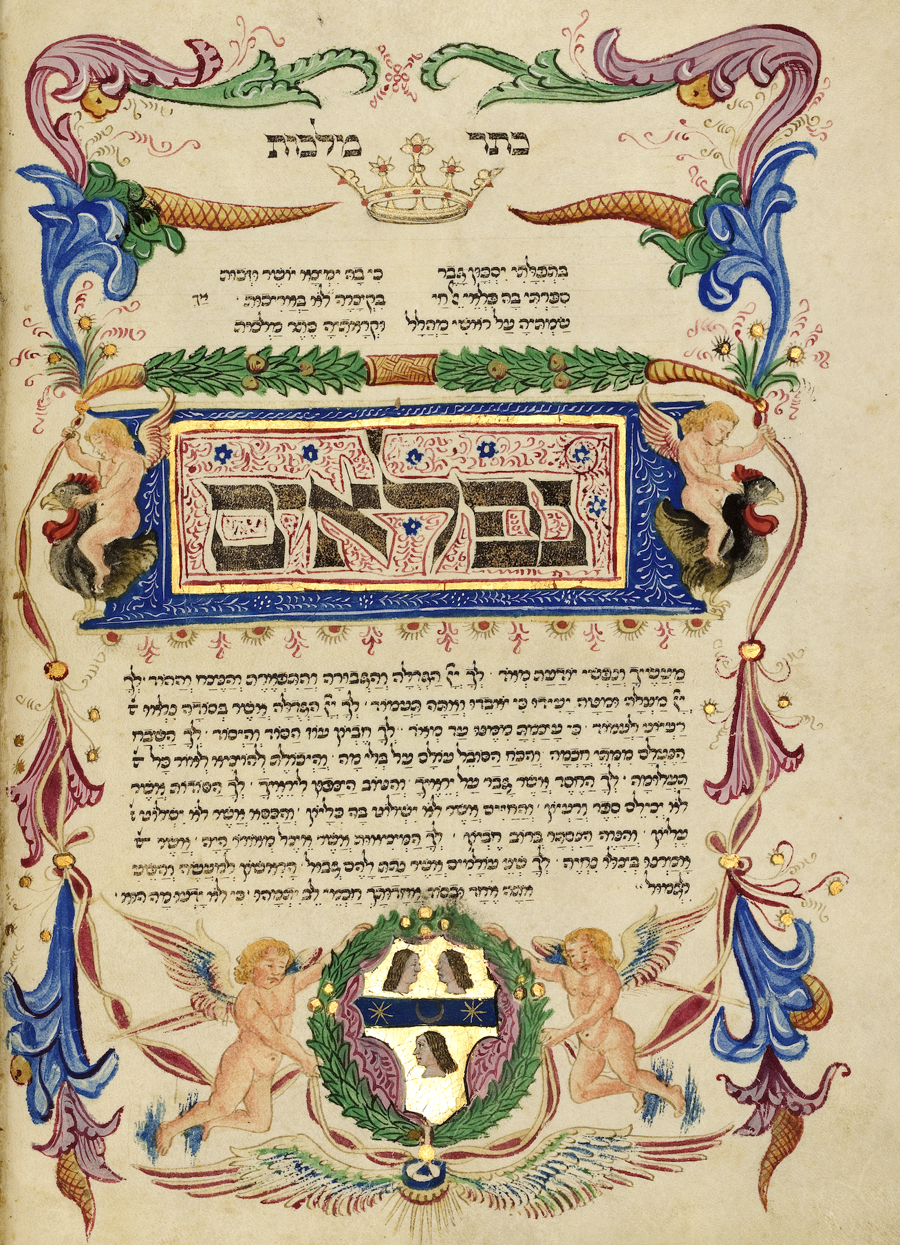
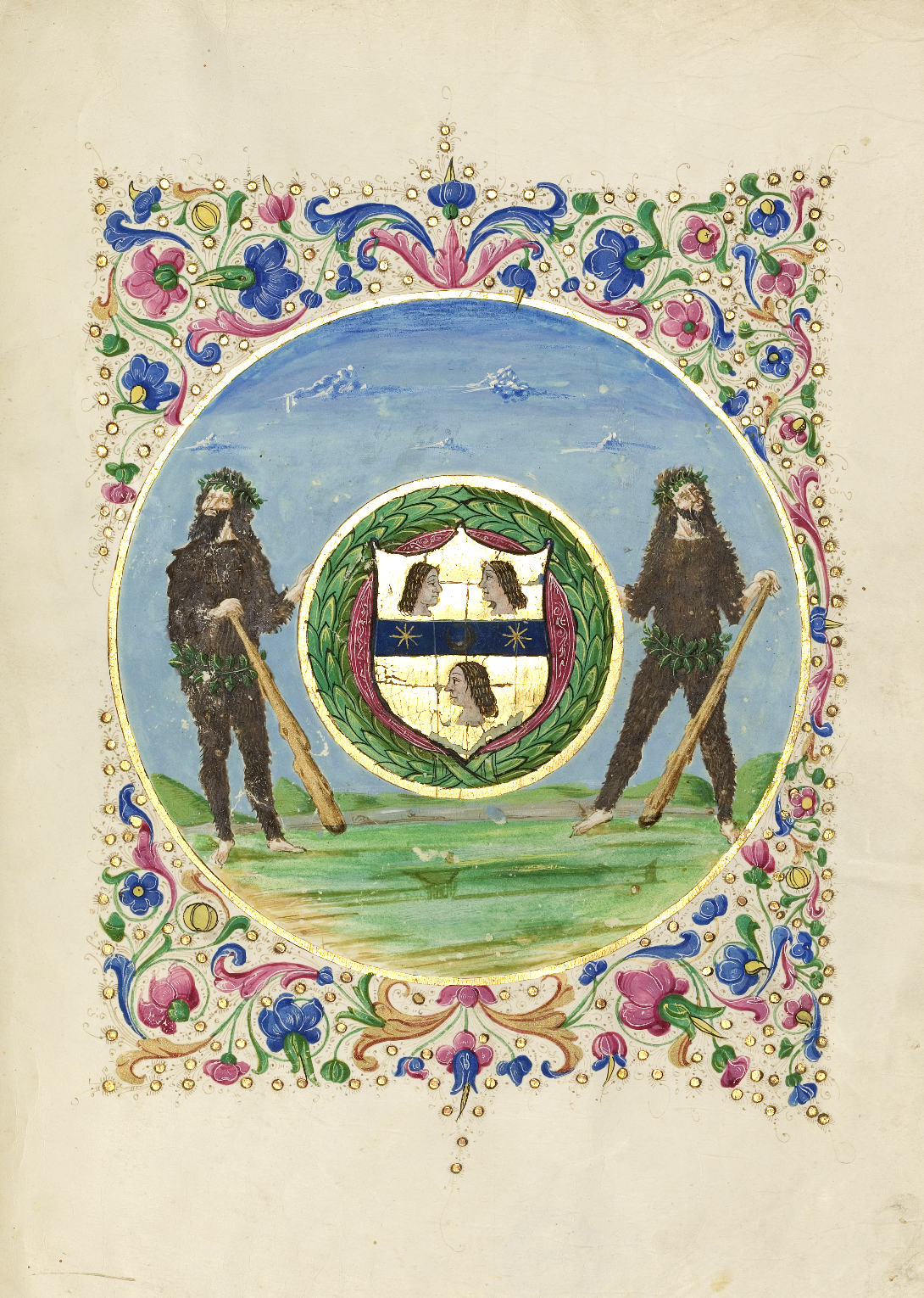
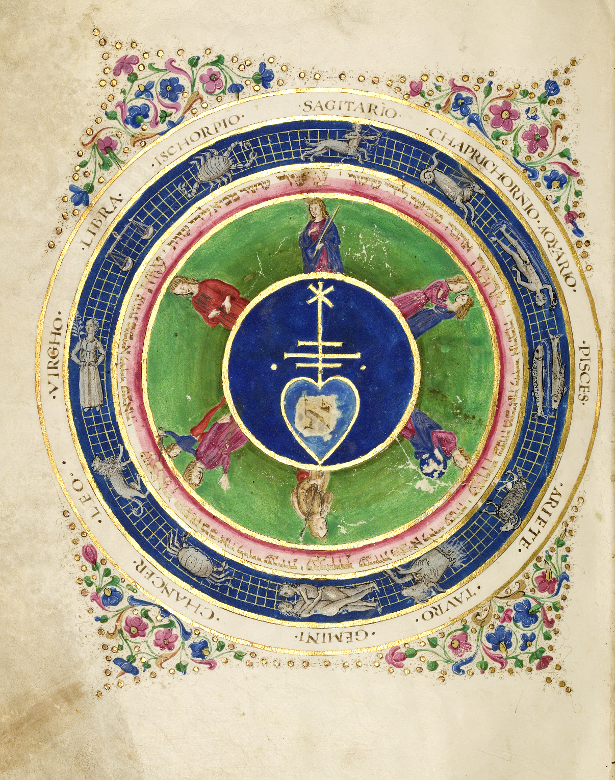
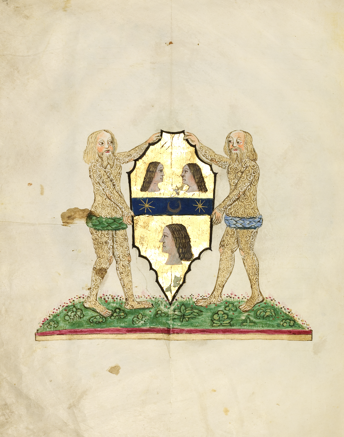
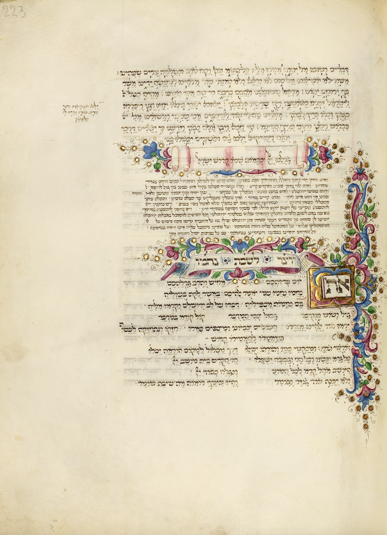
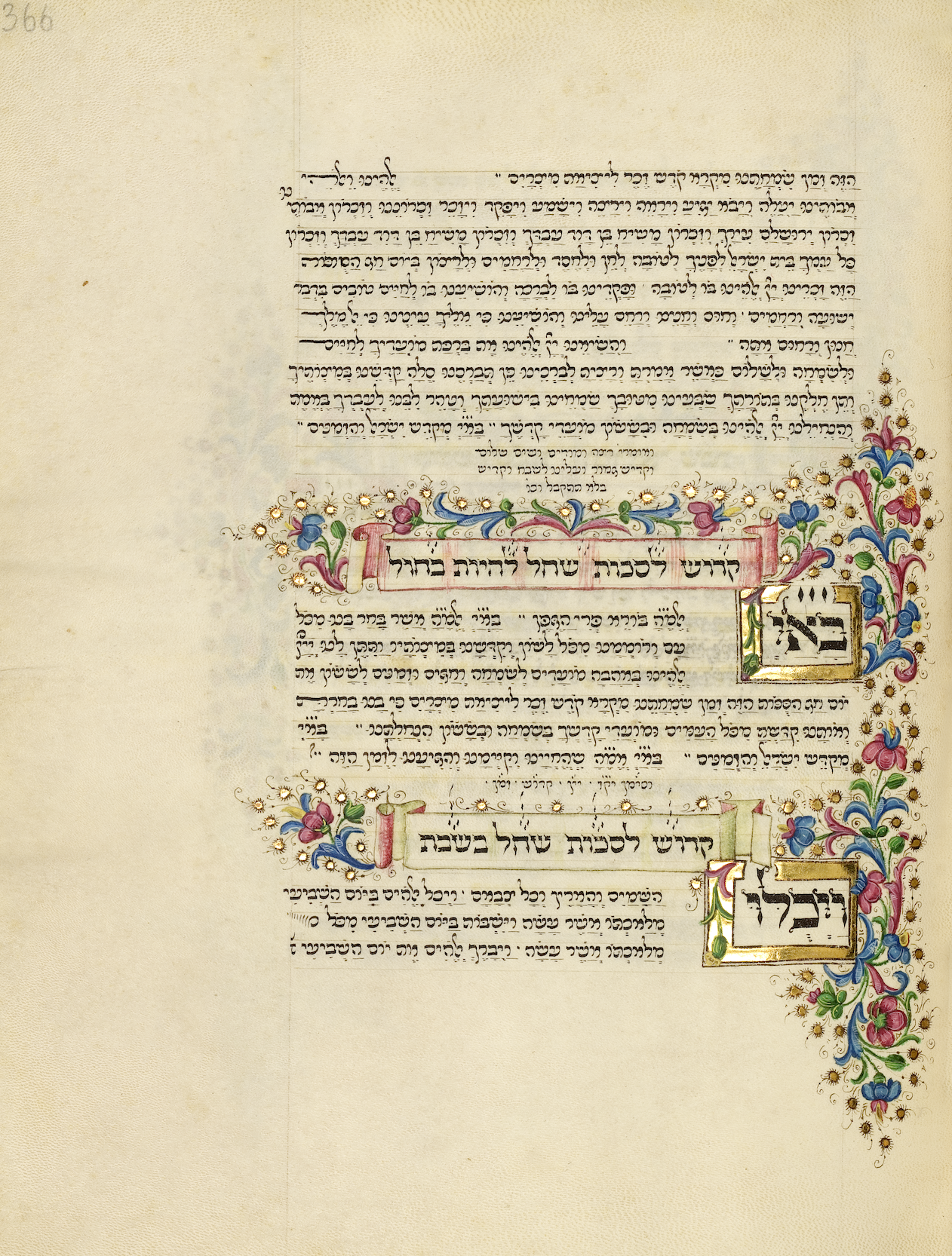
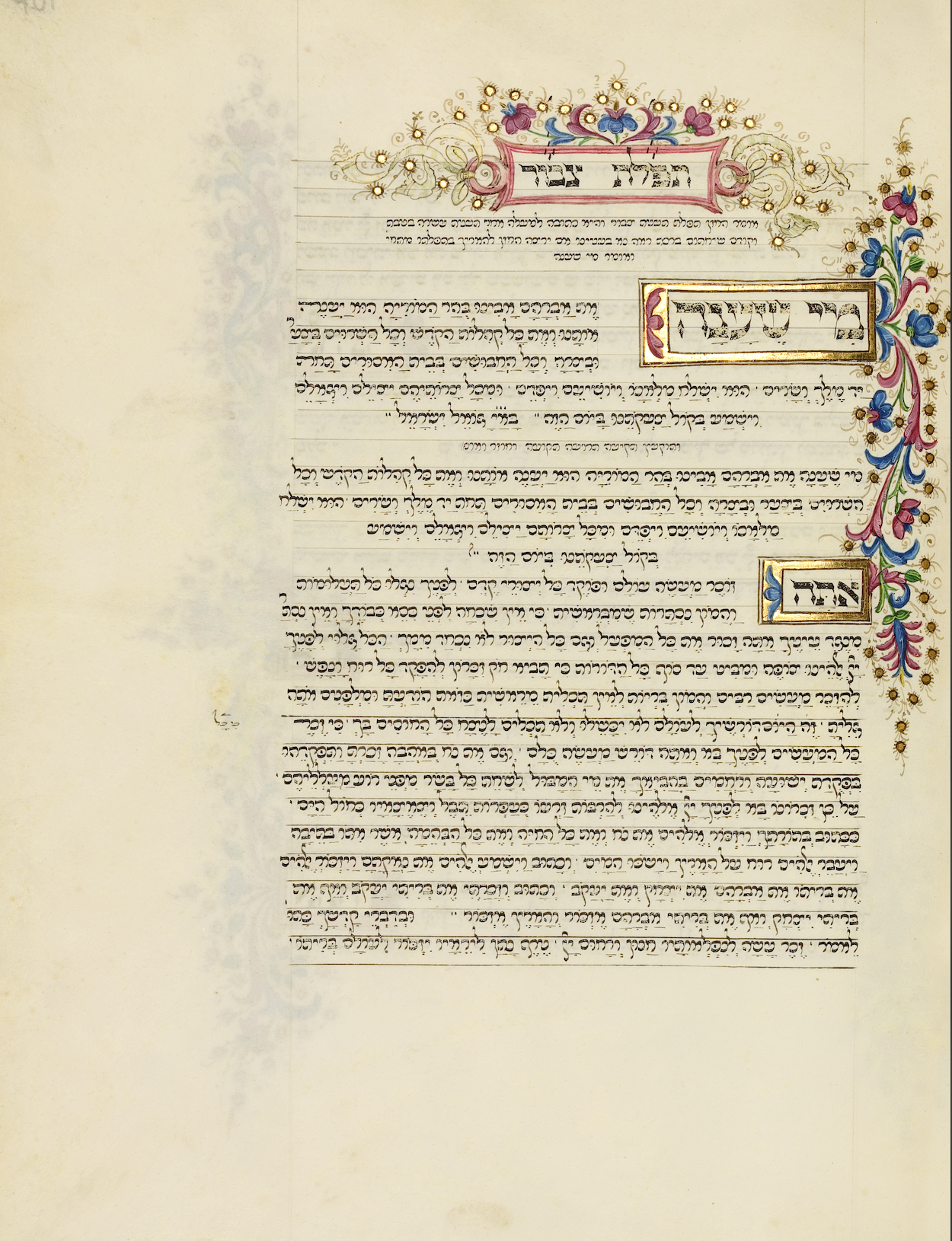
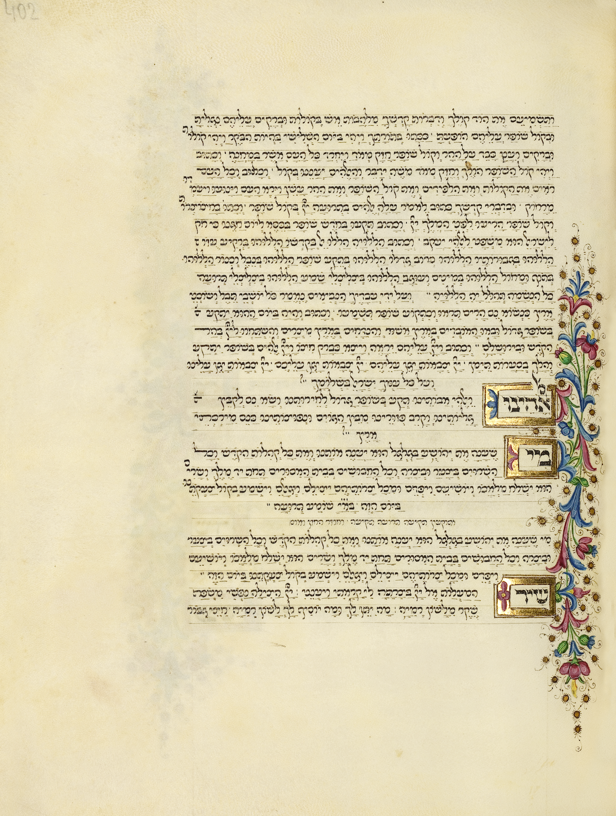
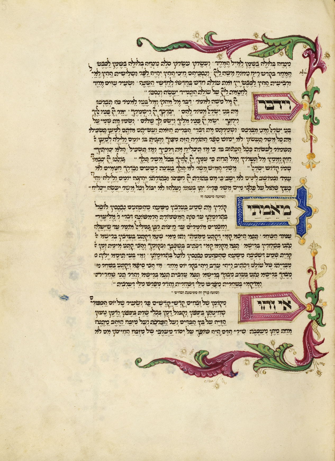
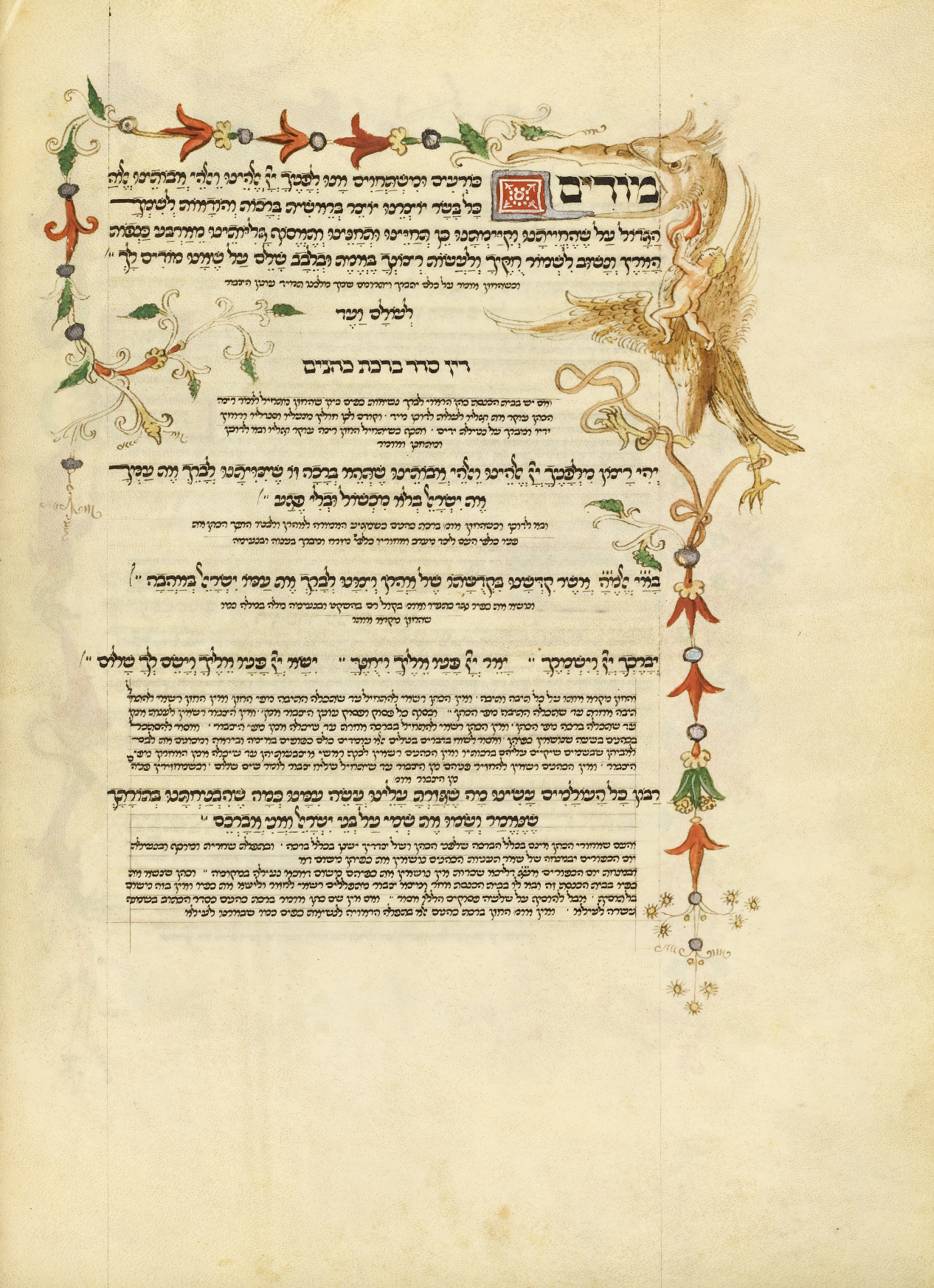
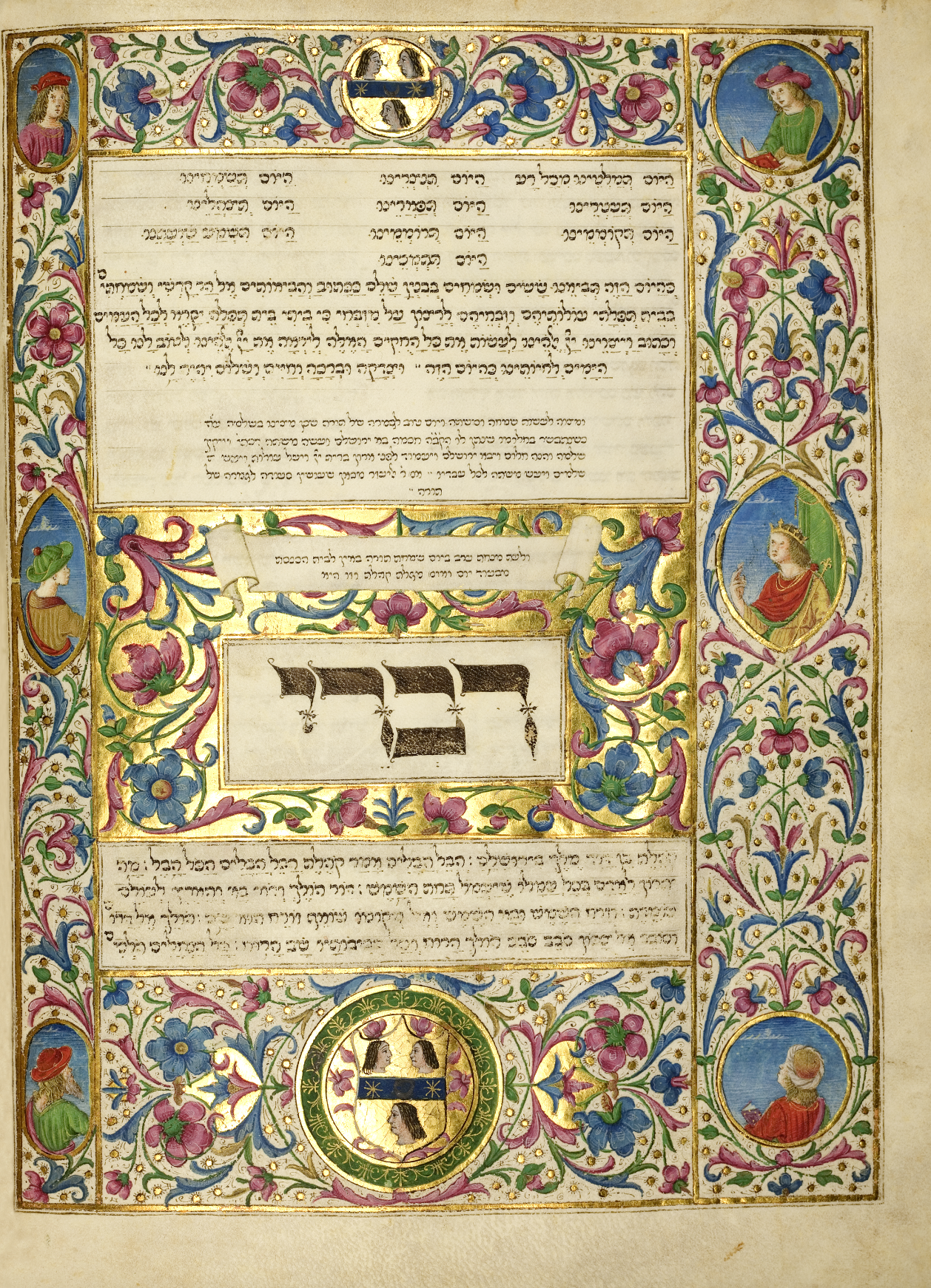
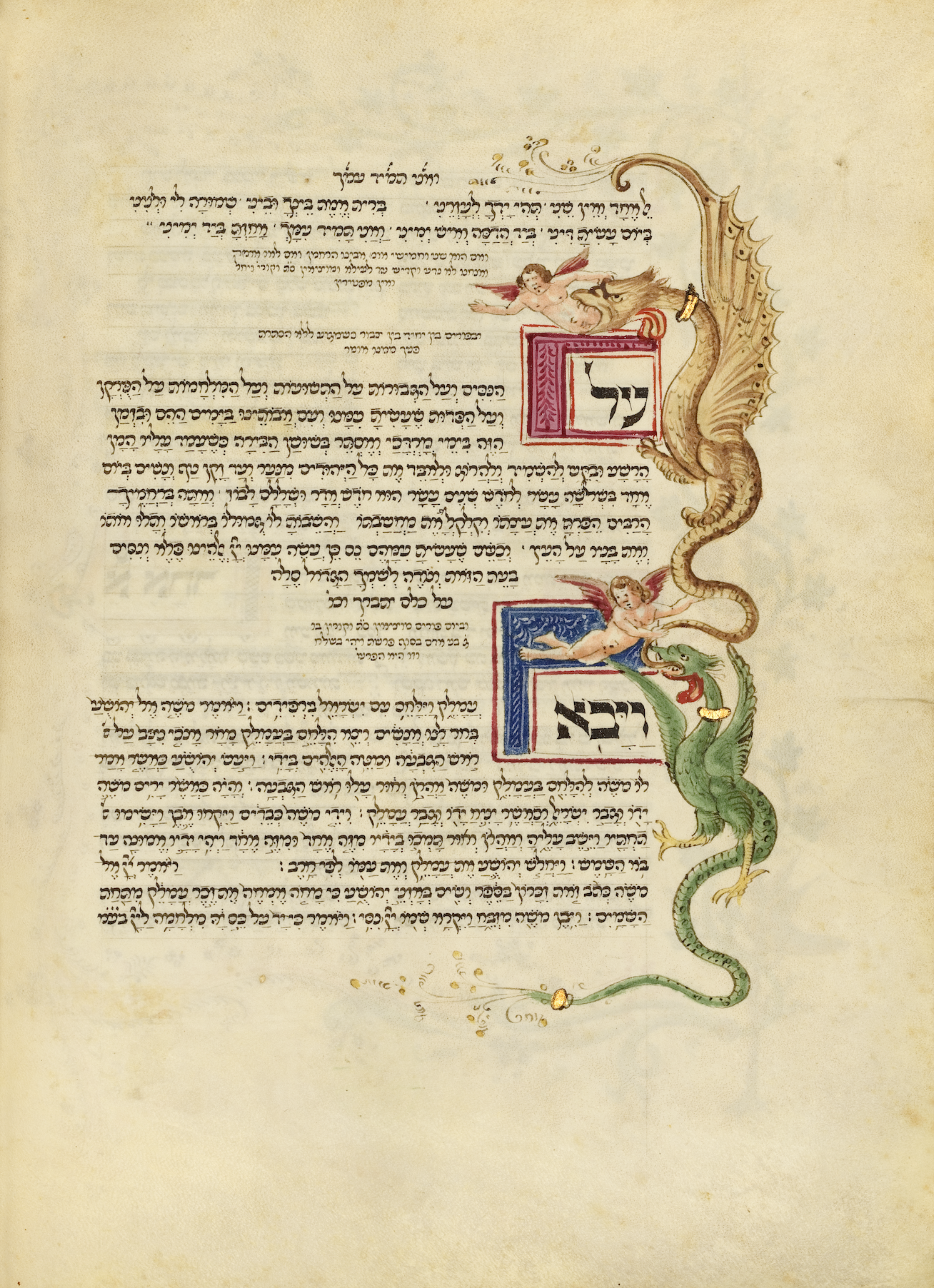
מחזור רוטשילד (JTS Ms. 8892) הוא אחד מכתבי היד העבריים המפוארים ביותר ששרדו מתקופת הרנסאנס האיטלקי. הוא נכתב בפירנצה בידי אברהם יהודה בן יחיאל מקמרינו, והושלם בחמישה עשר בפברואר אלף ארבע מאות תשעים. המחזור משמש ספרייה משפחתית שלמה בכרך אחד, ובה תפילות, פיוטים, הלכות, עצות רפואיות, חוזים, חישובי לוח שנה וידע מעשי. כך הוא מעניק הצצה נדירה לחיי משפחה יהודית אמידה באיטליה של הרנסאנס.The Rothschild Mahzor (JTS Ms. 8892) is one of the most magnificent Hebrew manuscripts to survive from the Italian Renaissance. It was written in Florence by Abraham Judah ben Yehiel of Camerino, and completed on February 15, 1490. The mahzor serves as an entire family library in a single volume, containing prayers, liturgical poems, halakhic rulings, medical advice, contracts, calendar calculations, and practical knowledge, offering a rare glimpse into the life of a well-to-do Jewish family in Renaissance Italy.Il Machazor Rothschild (JTS Ms. 8892) è uno dei manoscritti ebraici più sontuosi sopravvissuti dal Rinascimento italiano. Fu scritto a Firenze da Abramo Yehuda ben Yechiel da Camerino, e completato il quindici febbraio millequattrocentonovanta. Il machazor funge da intera biblioteca familiare in un unico volume, contenente preghiere, poemi liturgici, norme halakhiche, consigli medici, contratti, calcoli calendariali e conoscenze pratiche, offrendo uno sguardo raro sulla vita di una famiglia ebraica agiata nell'Italia rinascimentale.
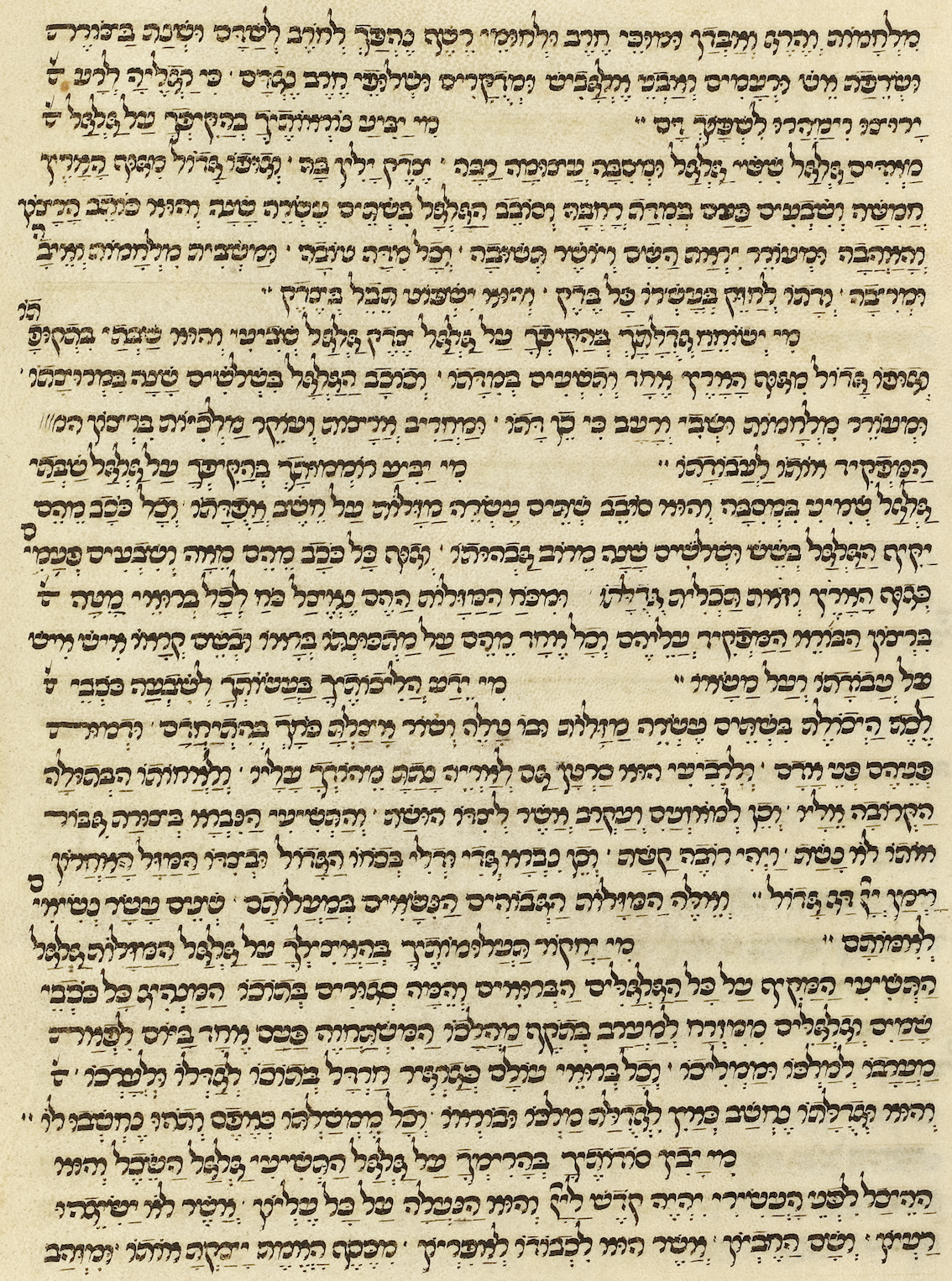
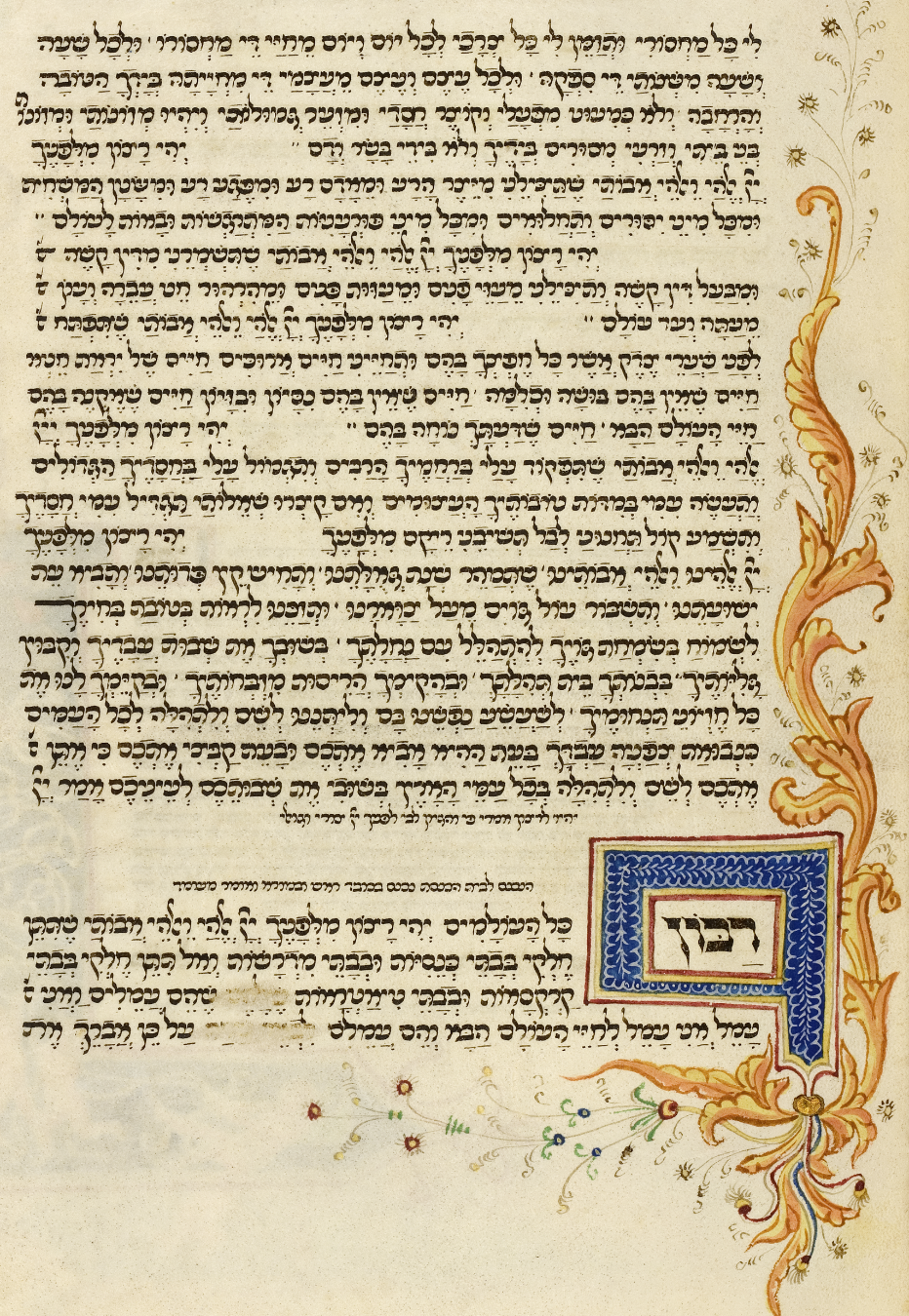
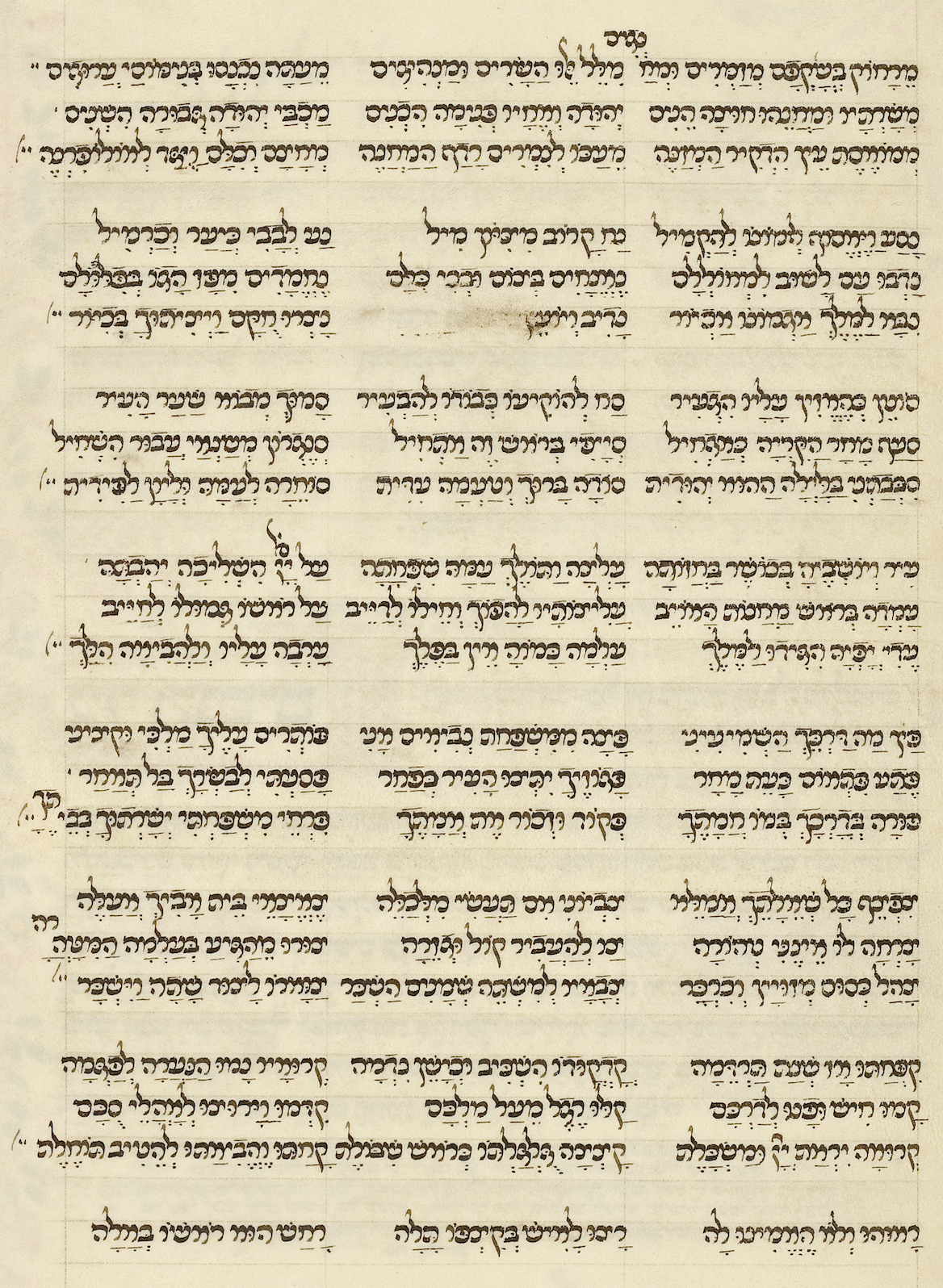
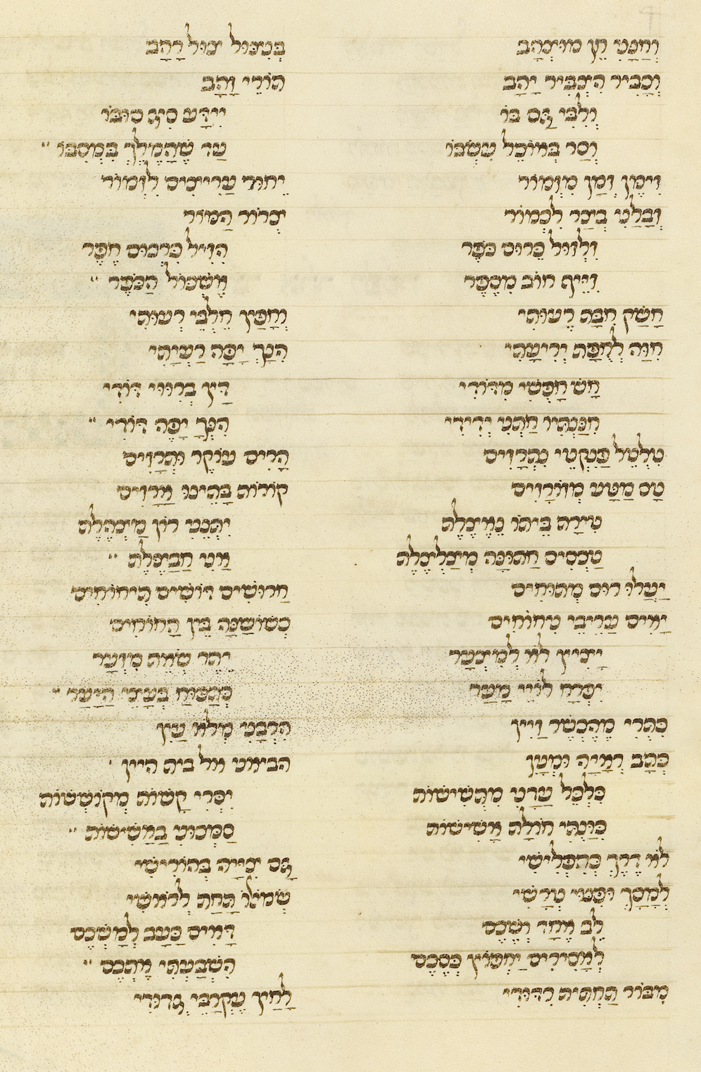
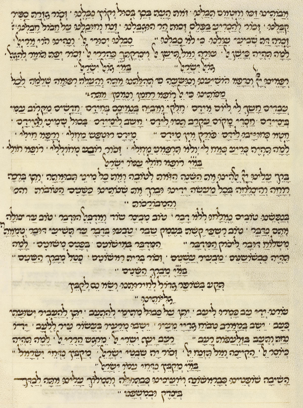
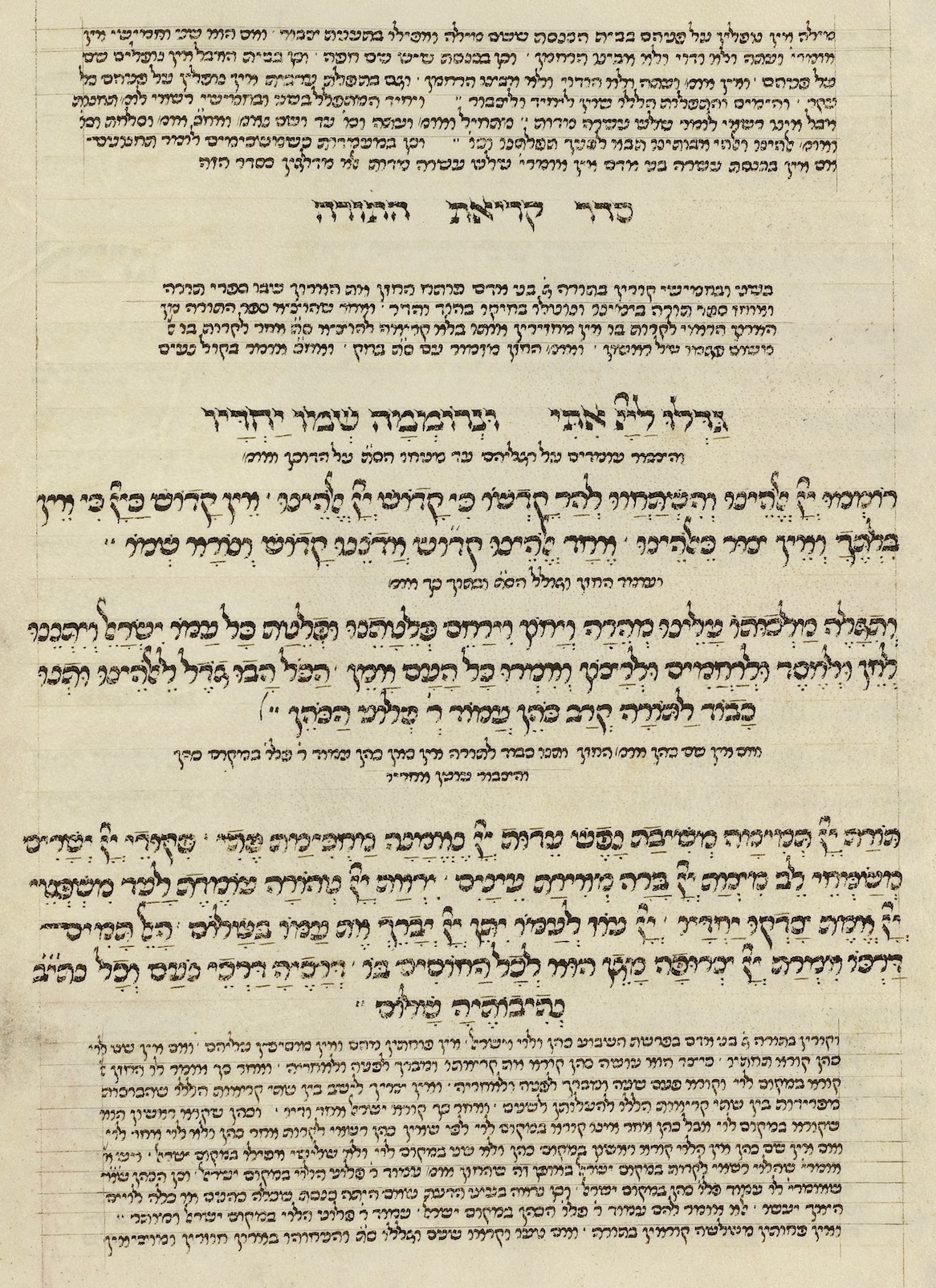
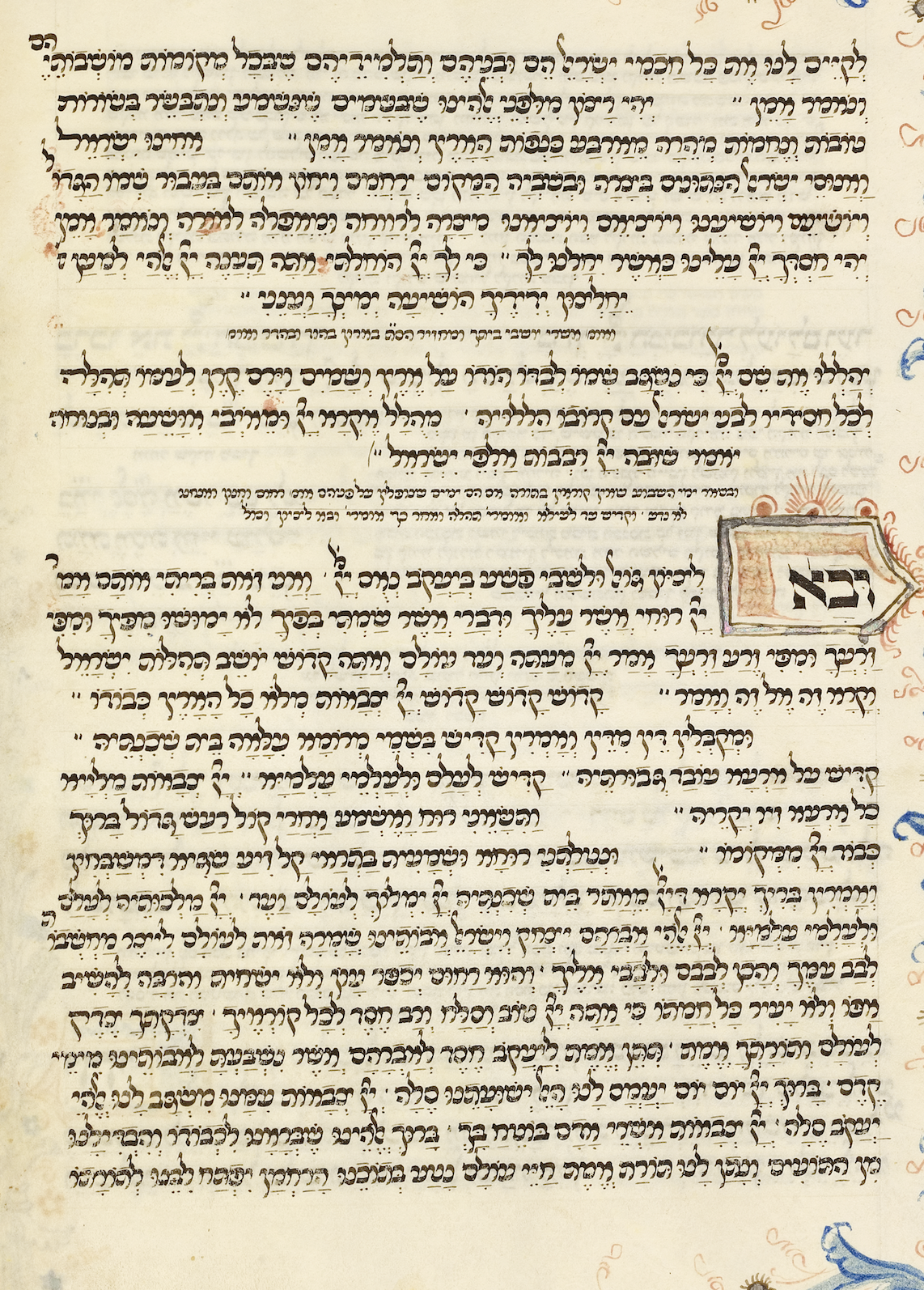
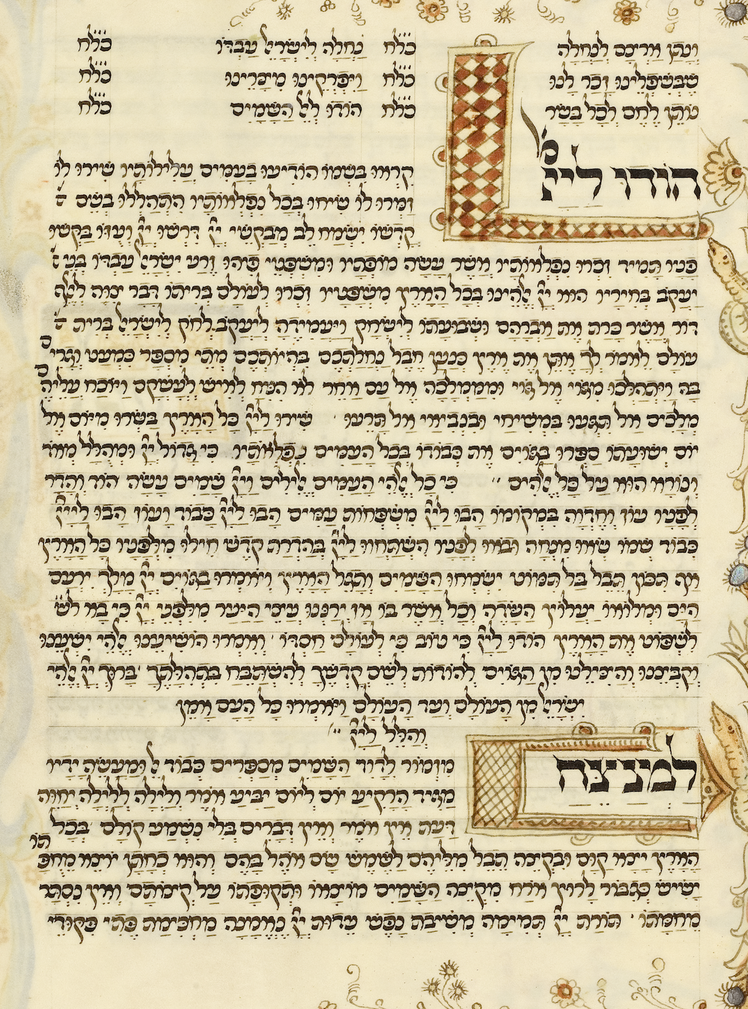
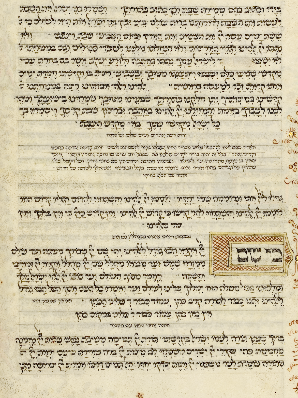
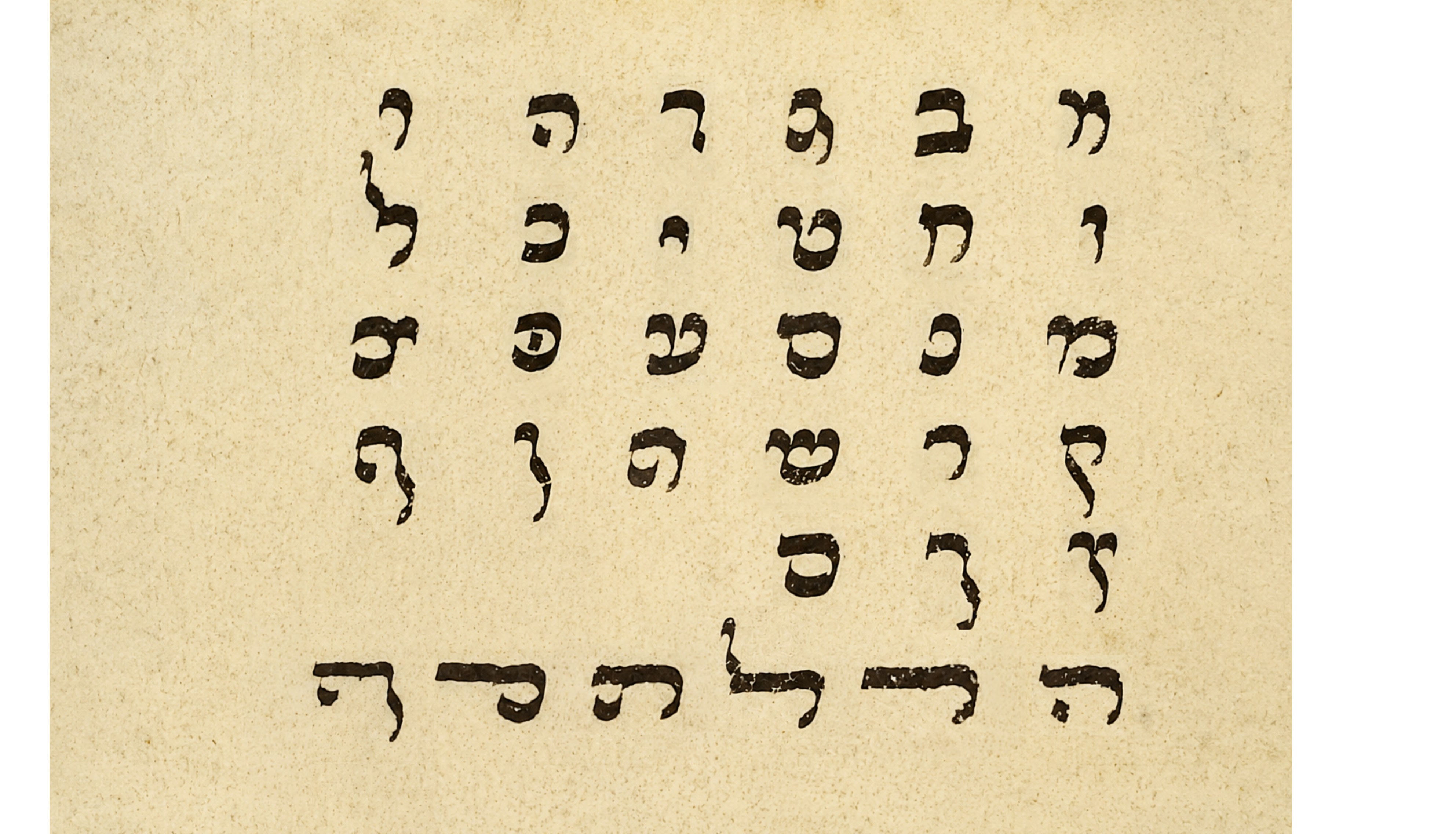
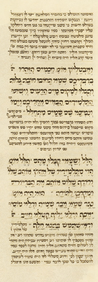
האותיות במחזור רוטשילד נכתבו בכתב חצי קורסיבי איטלקי , שהשפעתו נקשרת מהכתב הלטיני הקרולינגי. בהשוואה לכתב
המרובע הפורמלי, צורות האות רכות וגמישות יותר, בעלות קימורים מודגשים, קצב קליגרפי ותנועה אורגנית על פני הקלף.
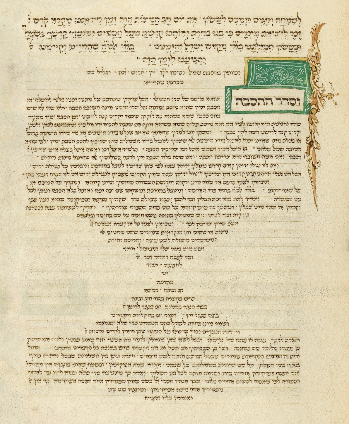
אברהם יהודה מקמרינו ניצל את גמישות הכתב כדי ליצור היררכיה ברורה באמצעות גדלים משתנים, מאותיות קטנות
להוראות ועד אותיות גדולות לפיוטים ולמילות פתיחה. המבנה הזורם אפשר לו גם לחרוג מסדר השורות הקבוע
ולעצב מילים שלמות בתבניות גיאומטריות מופשטות, ששימשו למילוי חללים
והפכו את הטקסט לחלק פעיל מן הקומפוזיציה.The letters of the Rothschild Mahzor were written in the Italian semi-cursive script, whose influence traces back to the Carolingian Latin hand. Compared to the formal square script, its letterforms are softer and more flexible, with pronounced curves, a calligraphic rhythm, and organic movement across the parchment. Abraham Judah of Camerino used this flexibility to create a clear hierarchy through varying sizes, ranging from small letters for instructions to large letters for liturgical poems and opening words. The flowing structure also let him break from the fixed line order and shape whole words into abstract geometric patterns, used to fill empty spaces and turning the text into an active part of the composition.Le lettere del Machazor Rothschild furono scritte nella scrittura semicorsiva italiana, la cui influenza risale alla scrittura latina carolingia. Rispetto alla scrittura quadrata formale, le sue forme sono più morbide e flessibili, con curve pronunciate, un ritmo calligrafico e un movimento organico sulla pergamena. Abramo Yehuda da Camerino sfruttò questa flessibilità per creare una chiara gerarchia attraverso dimensioni variabili, che vanno da lettere piccole per le istruzioni a lettere grandi per i poemi liturgici e le parole di apertura. La struttura fluida gli permise anche di allontanarsi dall'ordine fisso delle righe e di comporre intere parole in motivi geometrici astratti, usati per riempire gli spazi vuoti e trasformare il testo in una parte attiva della composizione.
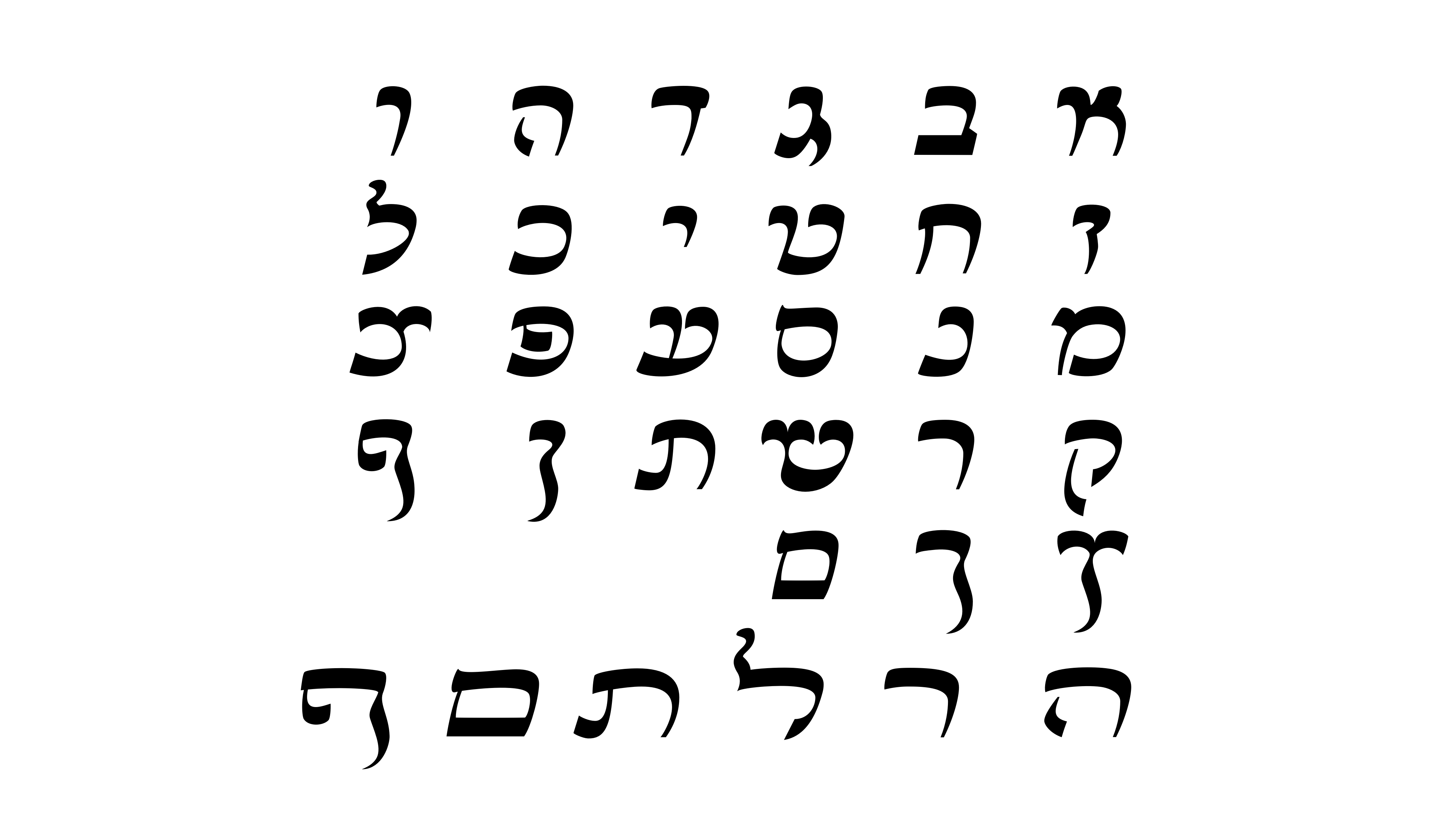
זהו עיצוב גופן המבוסס על הכתב החצי קורסיבי האיטלקי שבו כתב אברהם יהודה בן יחיאל מקמרינו את מחזור רוטשילד
בפירנצה בשנת אלף ארבע מאות תשעים. צורת הכתב משקפת את הסביבה החזותית של הרנסאנס ואת ההשפעה
ההומניסטית של התקופה, הניכרת בעגלגלות, באיזון ובתנועה האורגנית של האותיות. תהליך העיצוב
שומר על המבנה, הקצב והקונטרסט של המקור, ובו בזמן מתמודד עם הצורך להפוך
כתב יד משתנה למערכת טיפוגרפית אחידה, קריאה ועקבית.This typeface is based on the Italian semi-cursive script in which Abraham Judah ben Yehiel of Camerino wrote the Rothschild Mahzor in Florence in 1490. The form of the script reflects the visual environment of the Renaissance and the humanist influence of the period, evident in the roundness, balance, and organic movement of its letters. The design process preserves the structure, rhythm, and contrast of the original, while at the same time meeting the need to turn a variable handwriting into a typographic system that is uniform, legible, and consistent.Questo carattere tipografico si basa sulla scrittura semicorsiva italiana con cui Abramo Yehuda ben Yechiel da Camerino scrisse il Machazor Rothschild a Firenze nel 1490. La forma della scrittura riflette l'ambiente visivo del Rinascimento e l'influenza umanistica dell'epoca, evidente nella rotondità, nell'equilibrio e nel movimento organico delle sue lettere. Il processo di progettazione preserva la struttura, il ritmo e il contrasto dell'originale, affrontando al contempo la necessità di trasformare una scrittura manoscritta variabile in un sistema tipografico uniforme, leggibile e coerente.
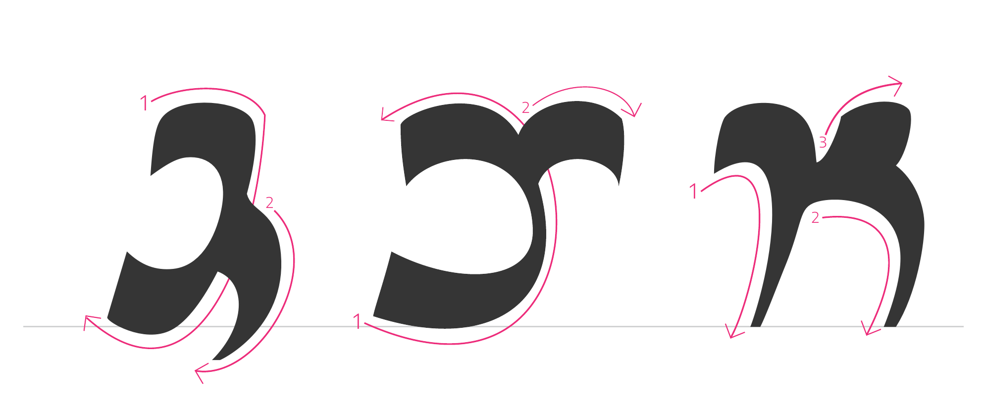
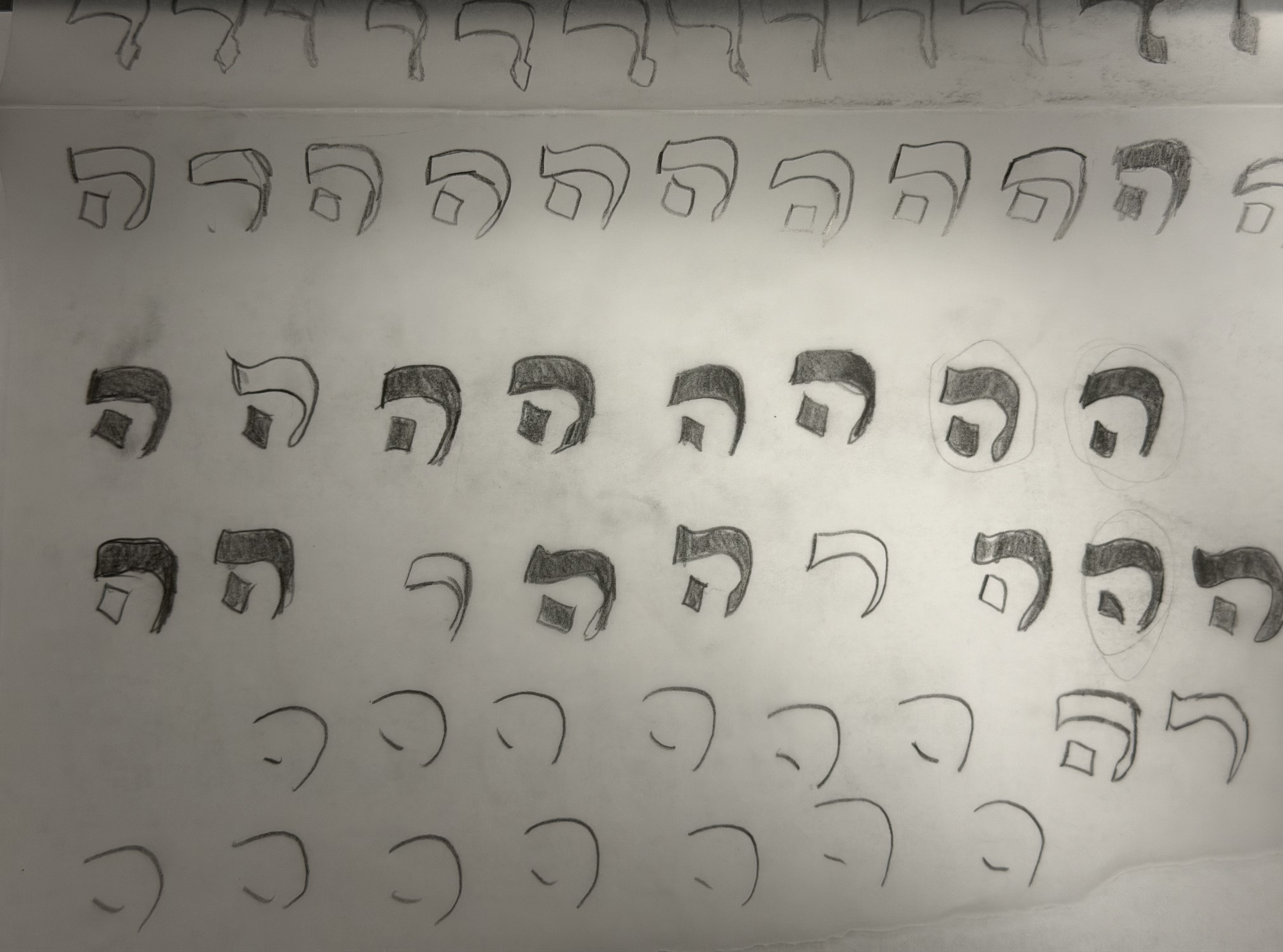
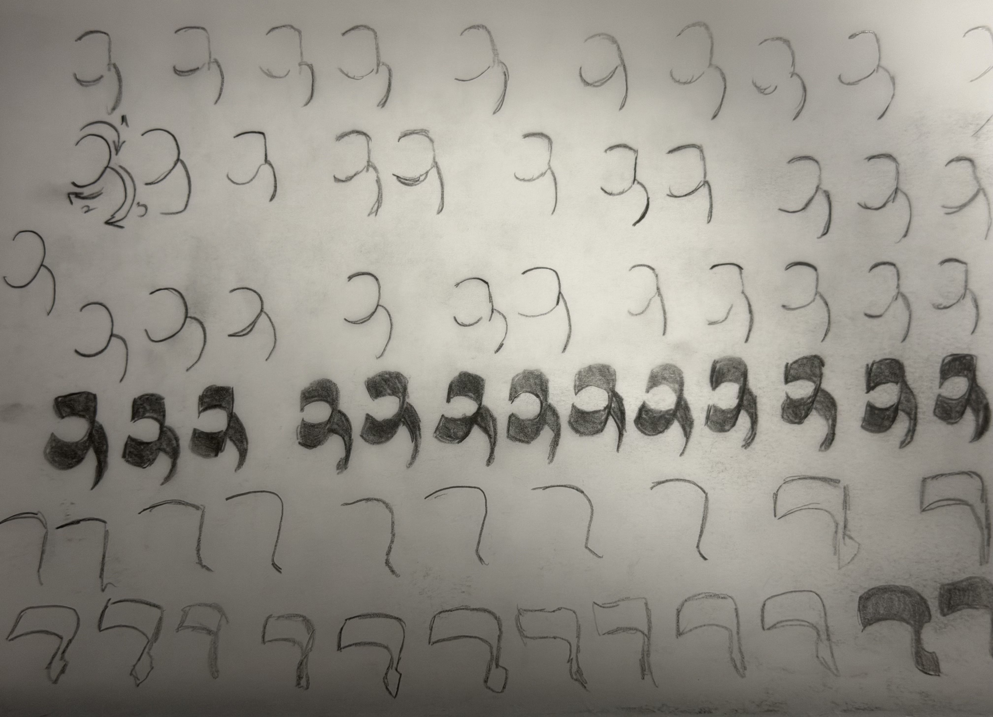
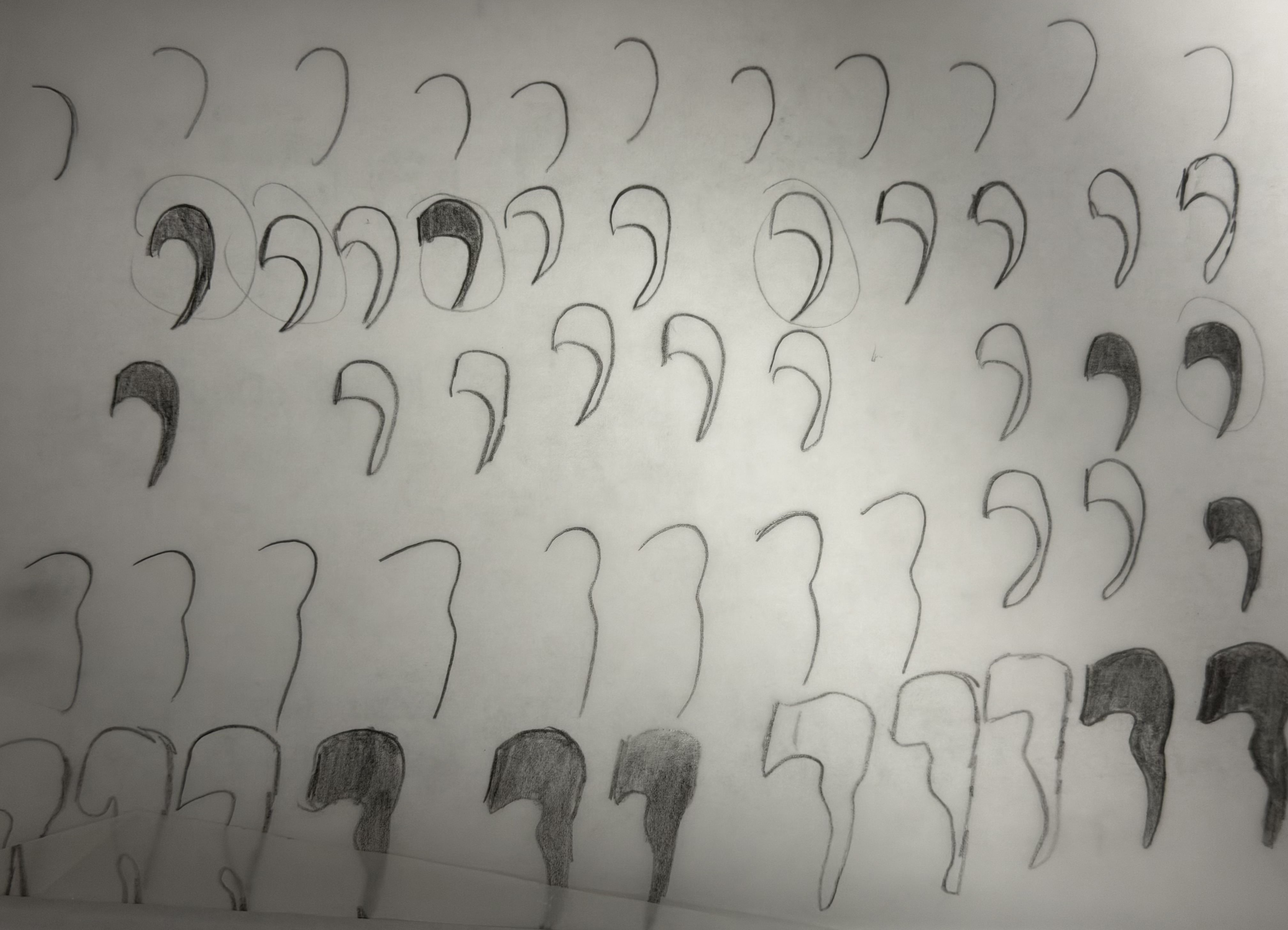
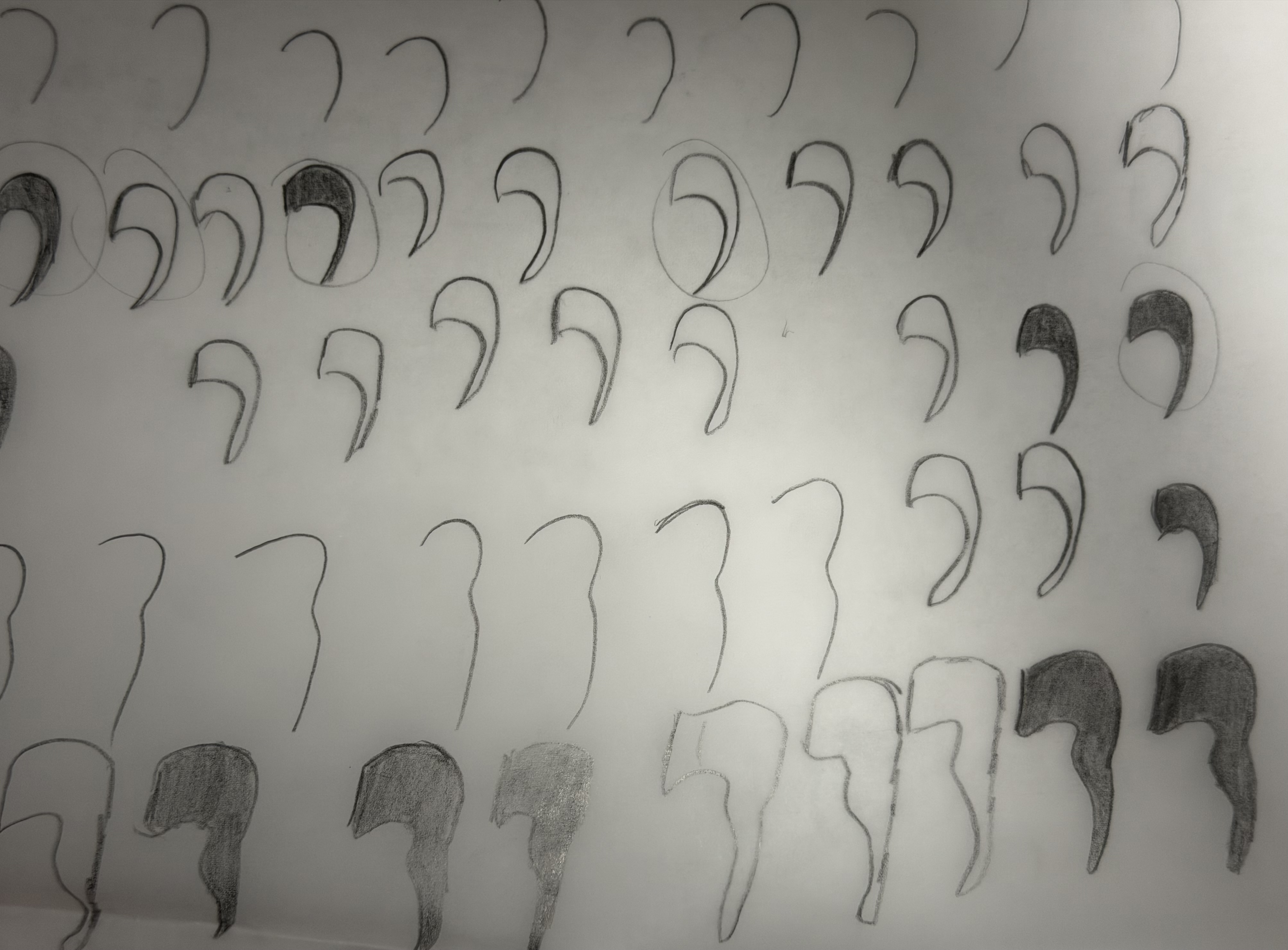
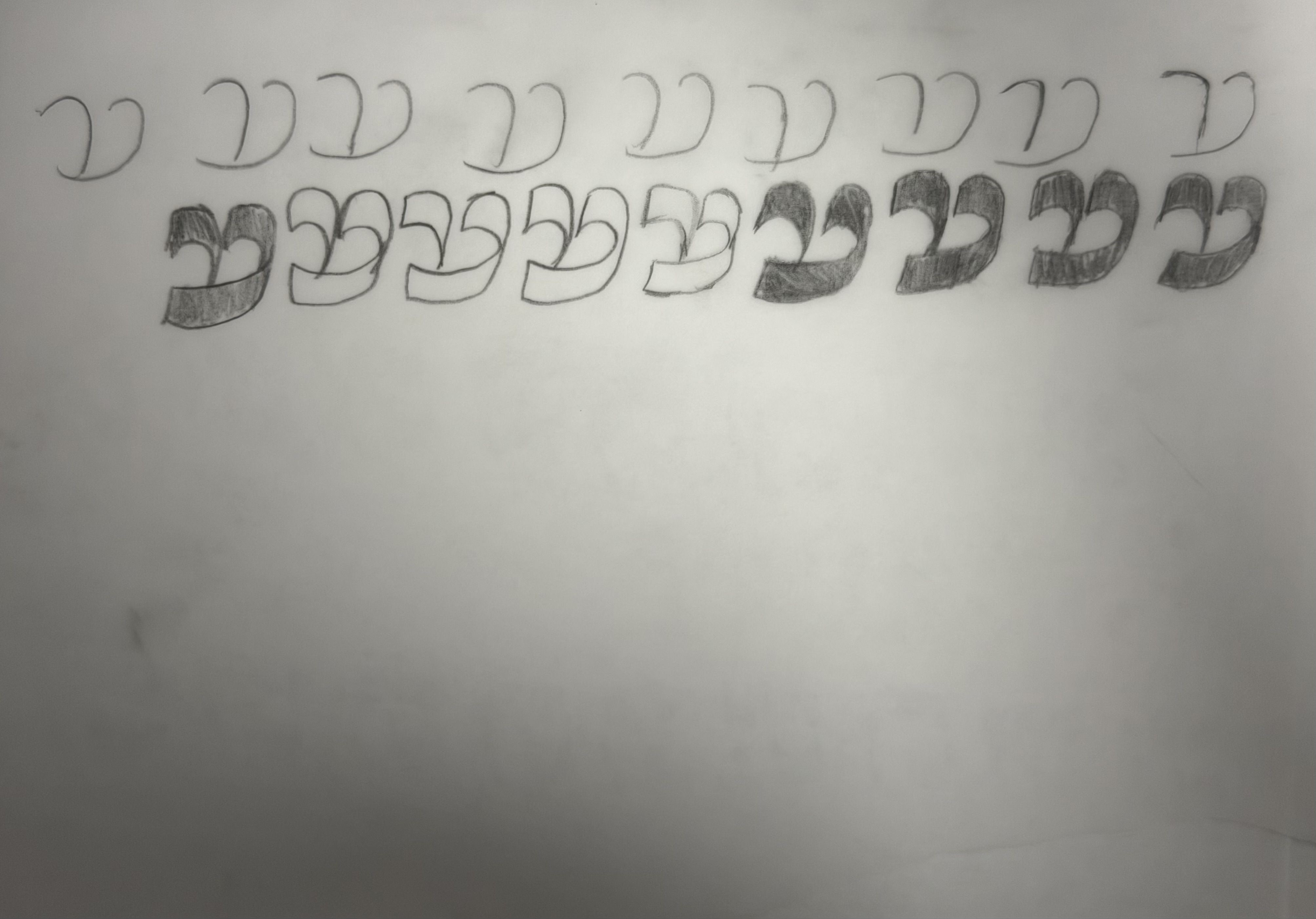
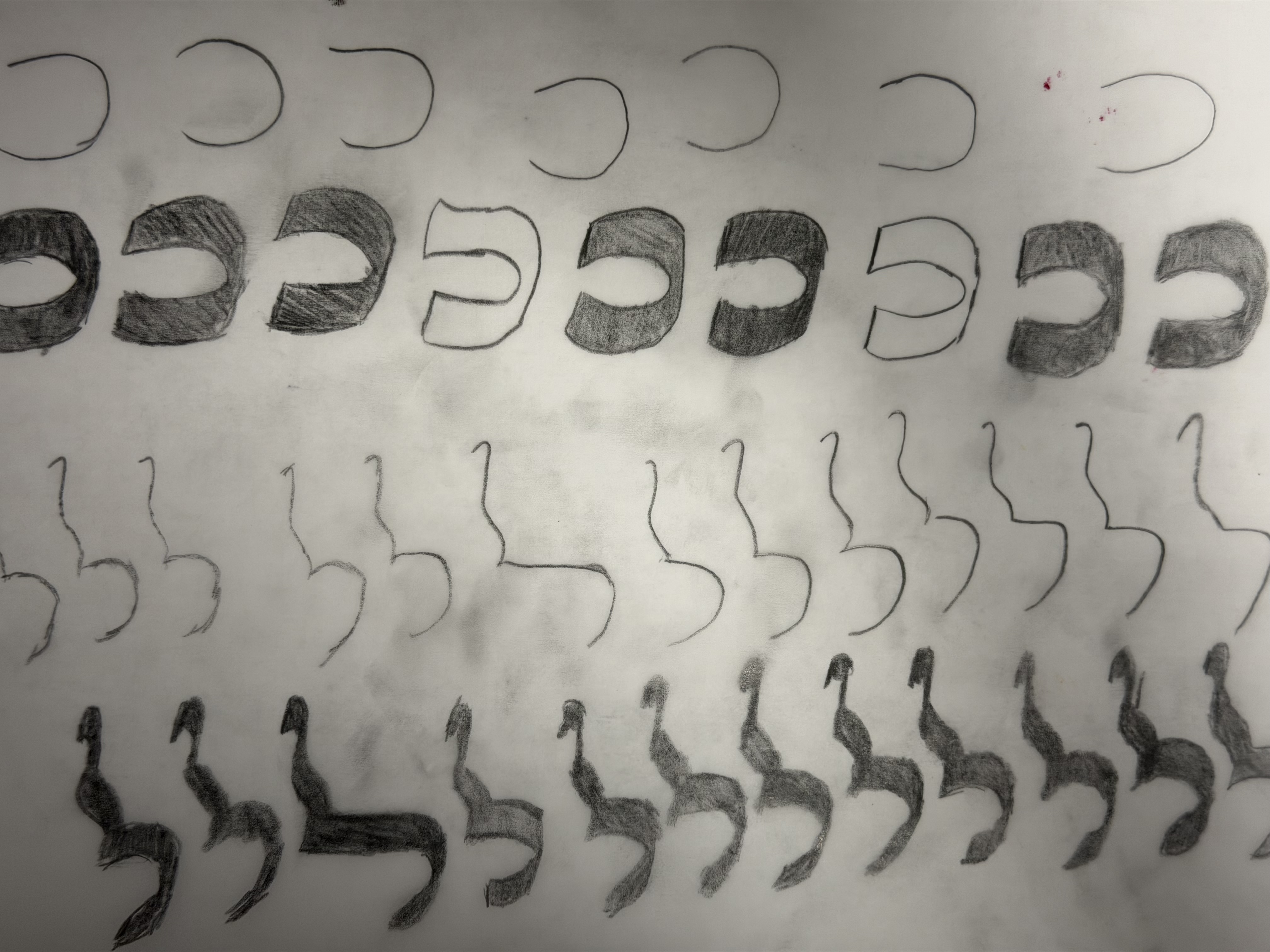
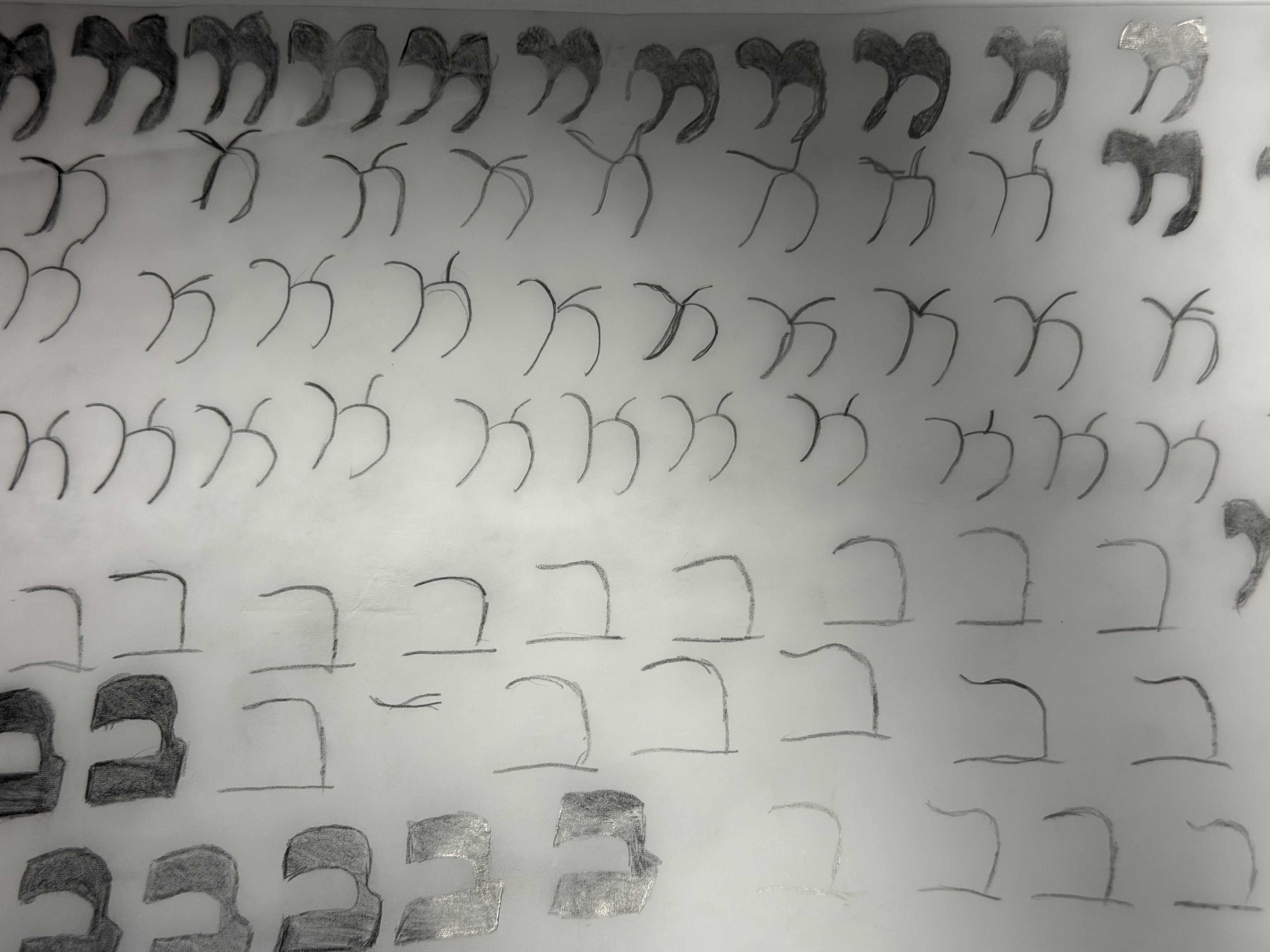
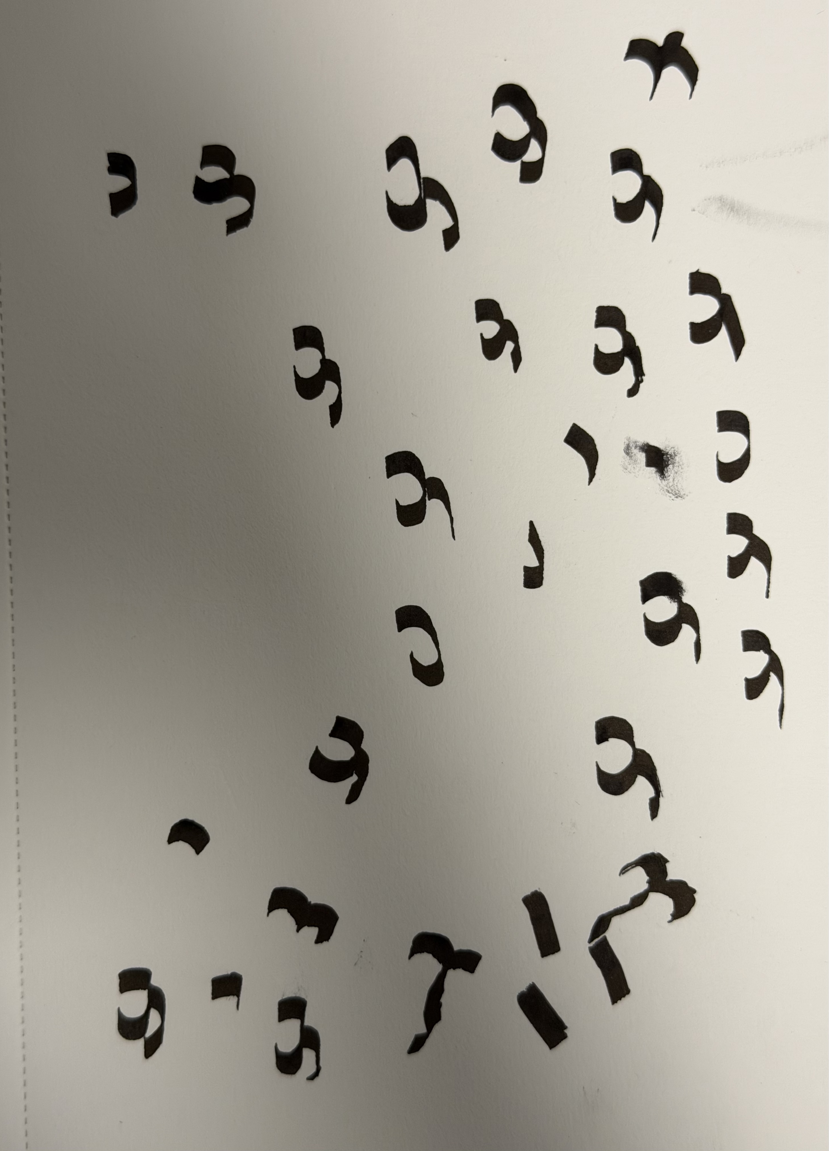
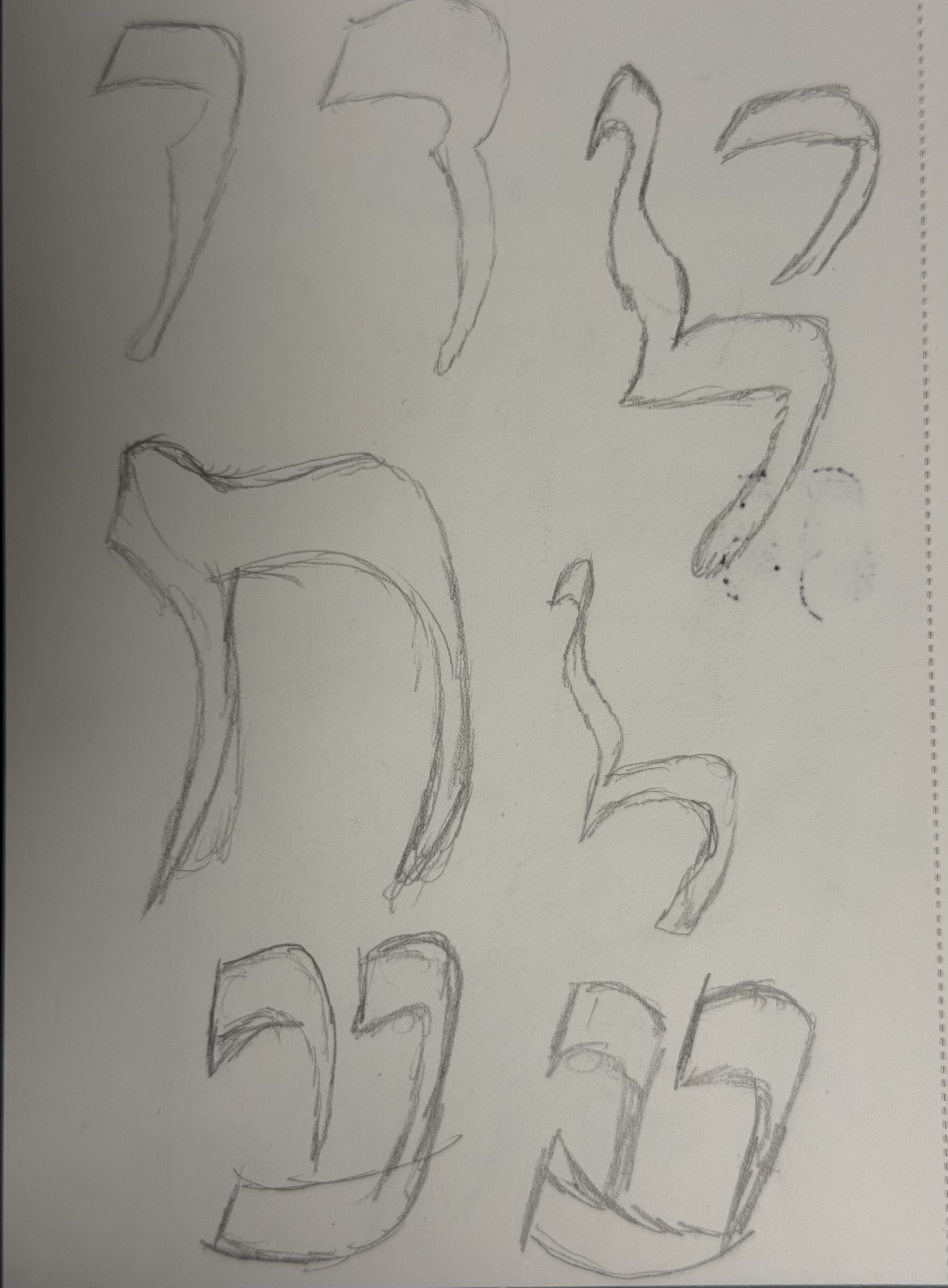
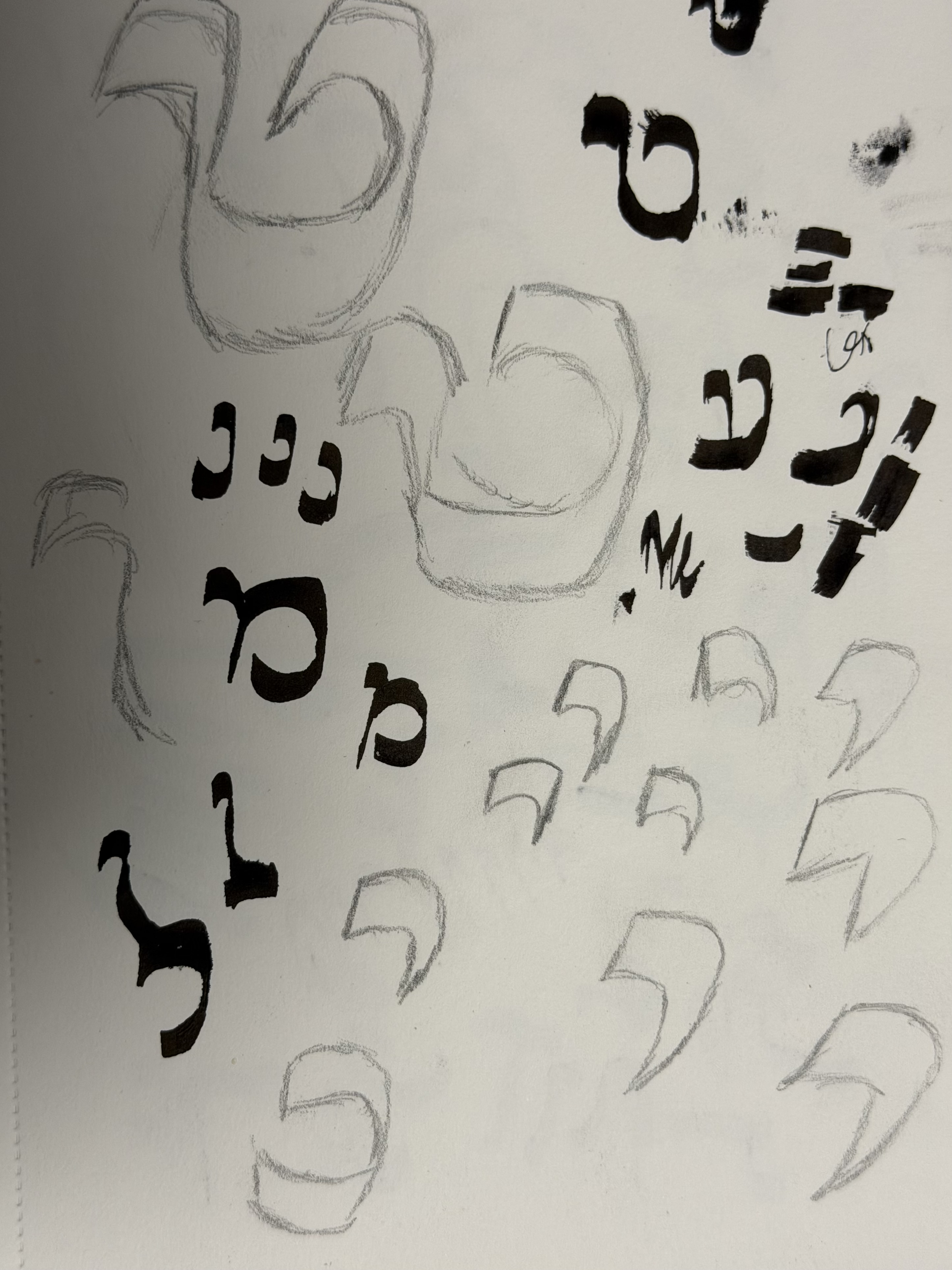
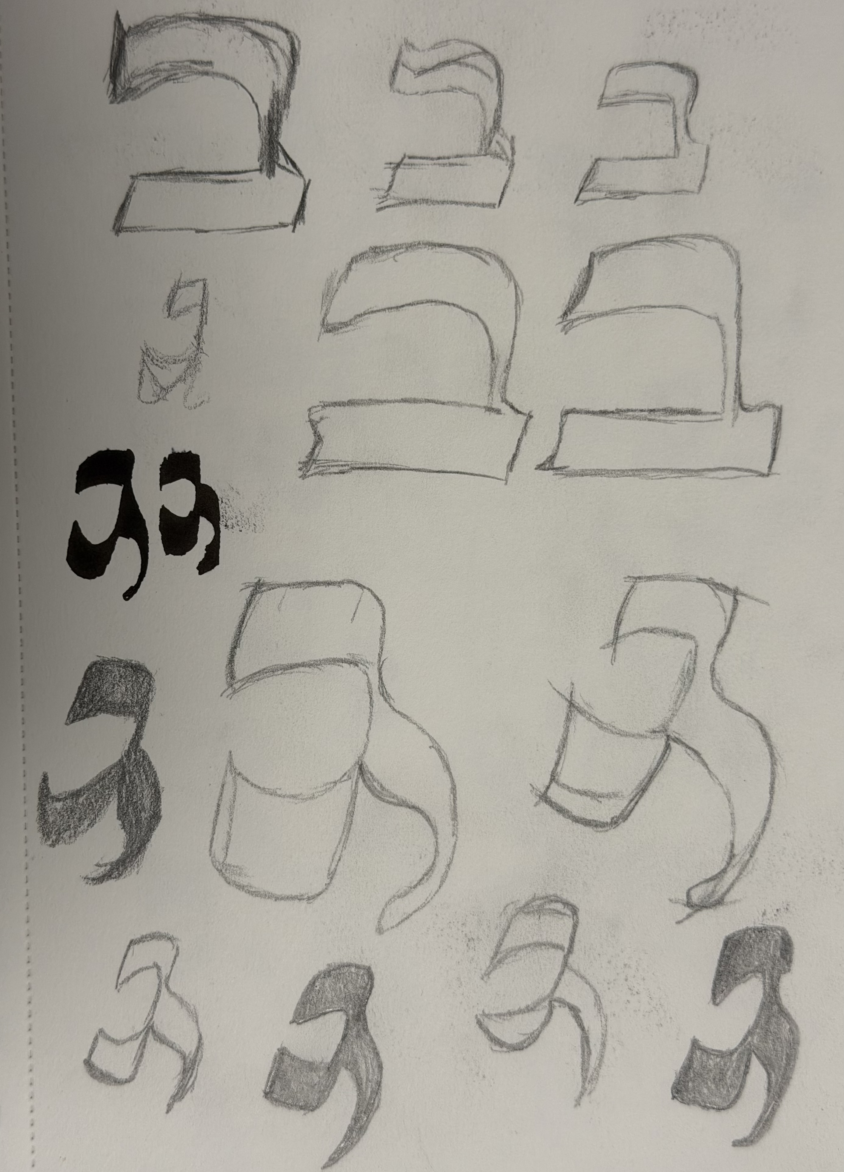
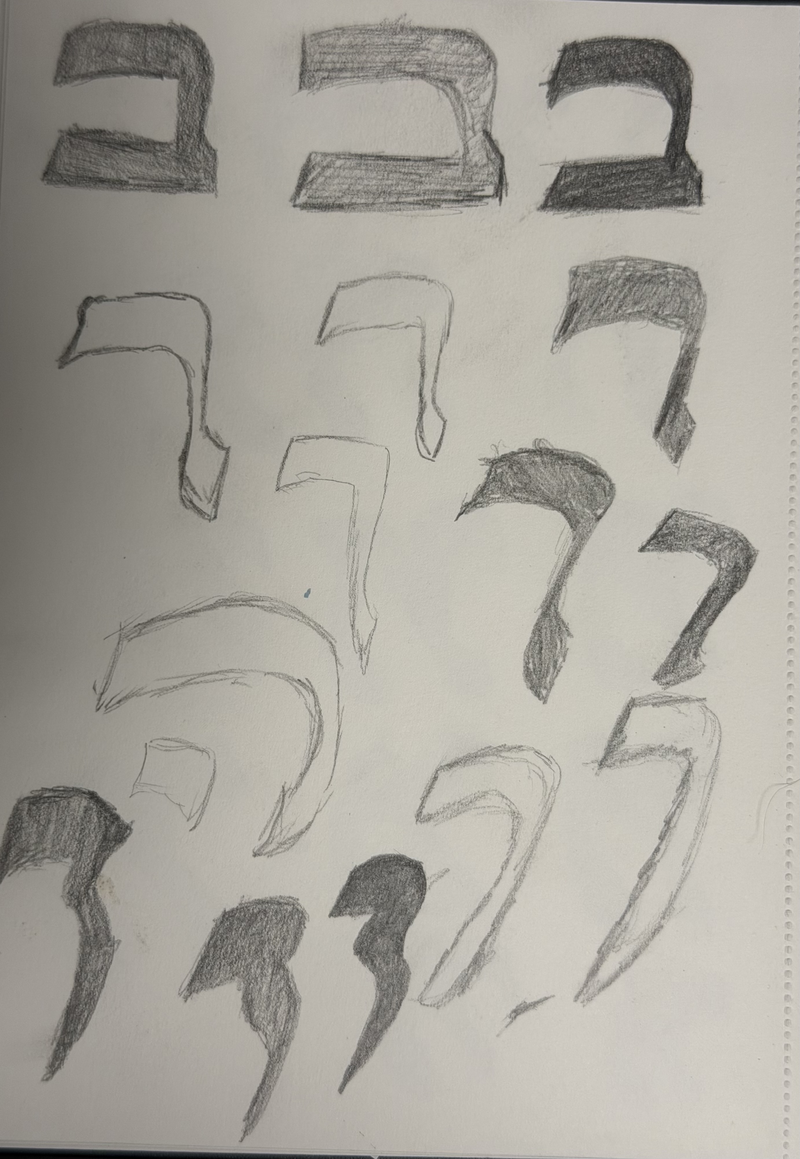
בשלב השני, לאחר המחקר הצורני, התחלתי לבחון כיצד נכתבו האותיות בפועל. כתבתי אות כדי להבין לעומק את תנועת היד,
כיוון הקו והקונטרסט שנוצר בזמן הכתיבה, ולנסות לשחזר את ההיגיון הקליגרפי של המקור. בהמשך ציירתי
סקיצות ושלדים לאותיות, במטרה לגבש צורה ברורה ומדויקת שאותה ניתן יהיה
להעביר לתוכנת גליפס ולהמשיך לפתח כמערכת טיפוגרפית.In the second stage, after the formal research, I began examining how the letters were actually written. I wrote them by hand to understand in depth the movement of the hand, the direction of the stroke, and the contrast created while writing, and to try to reconstruct the calligraphic logic of the original. I then drew sketches and skeletons for the letters, aiming to arrive at a clear, precise form that could be brought into Glyphs and further developed as a typographic system.Nella seconda fase, dopo la ricerca formale, ho iniziato a esaminare come venivano effettivamente scritte le lettere. Le ho scritte a mano per comprendere a fondo il movimento della mano, la direzione del tratto e il contrasto creato durante la scrittura, e per cercare di ricostruire la logica calligrafica dell'originale. In seguito ho disegnato schizzi e scheletri delle lettere, con l'obiettivo di arrivare a una forma chiara e precisa che potesse essere trasferita in Glyphs e ulteriormente sviluppata come sistema tipografico.
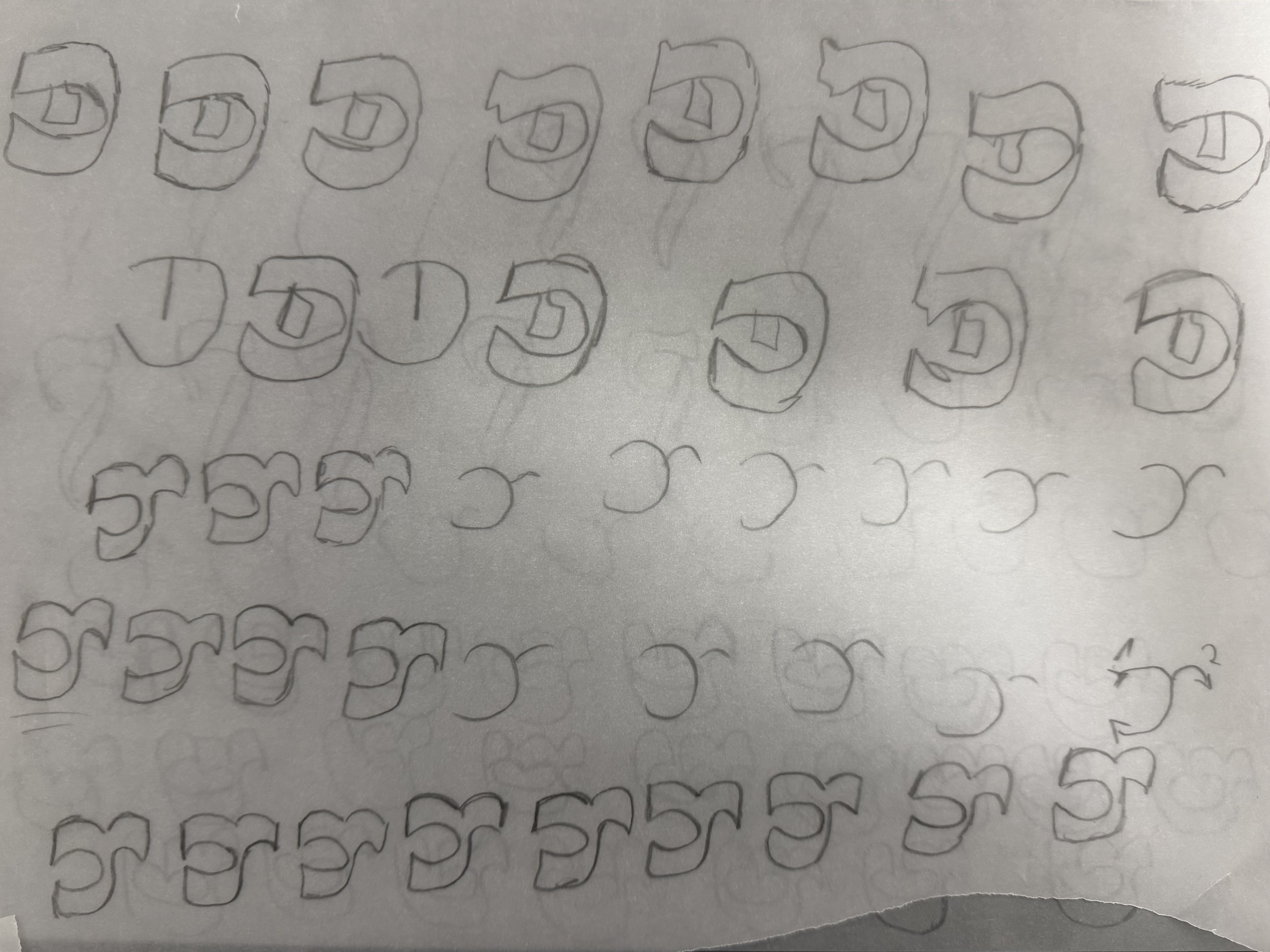
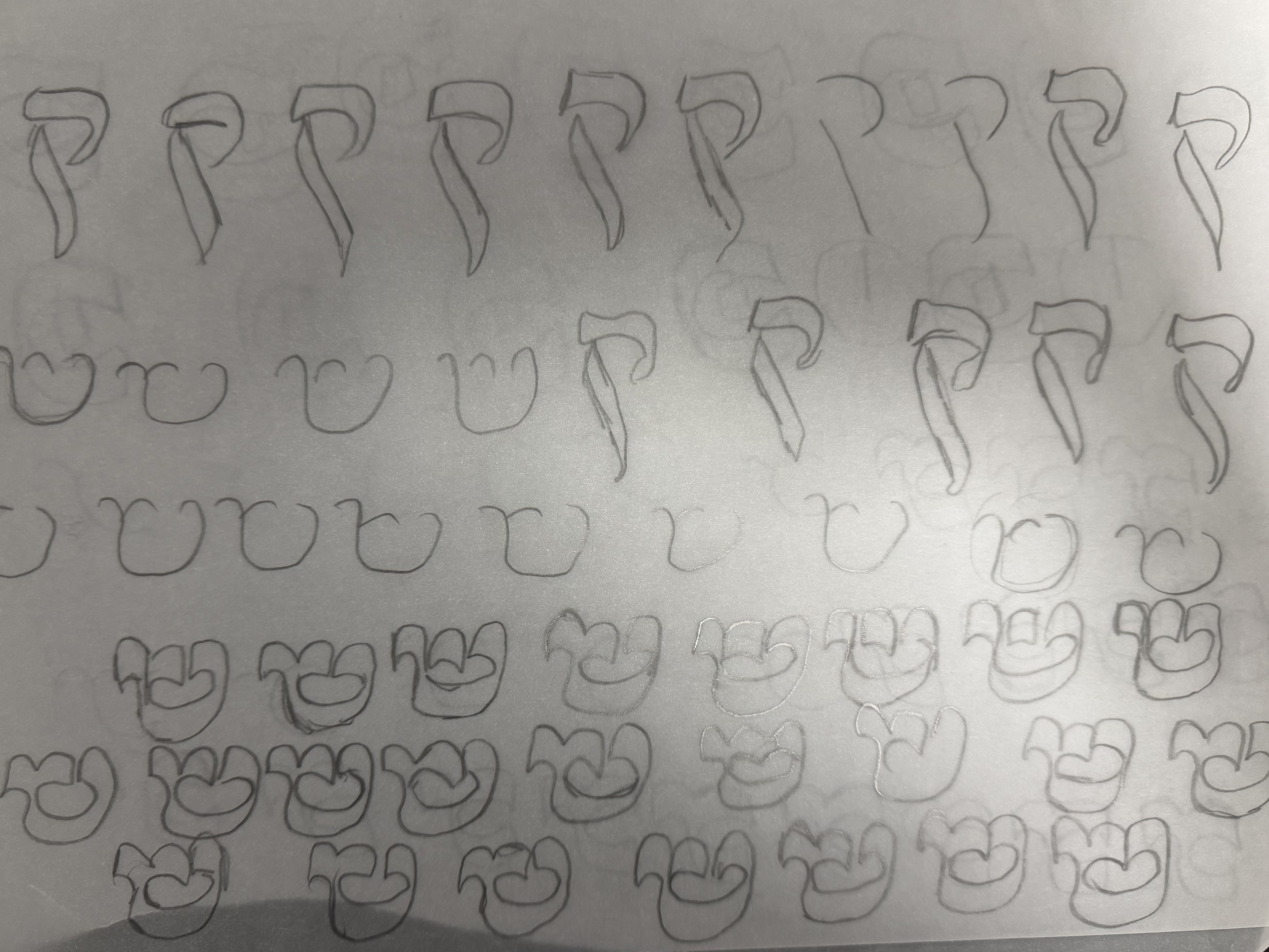
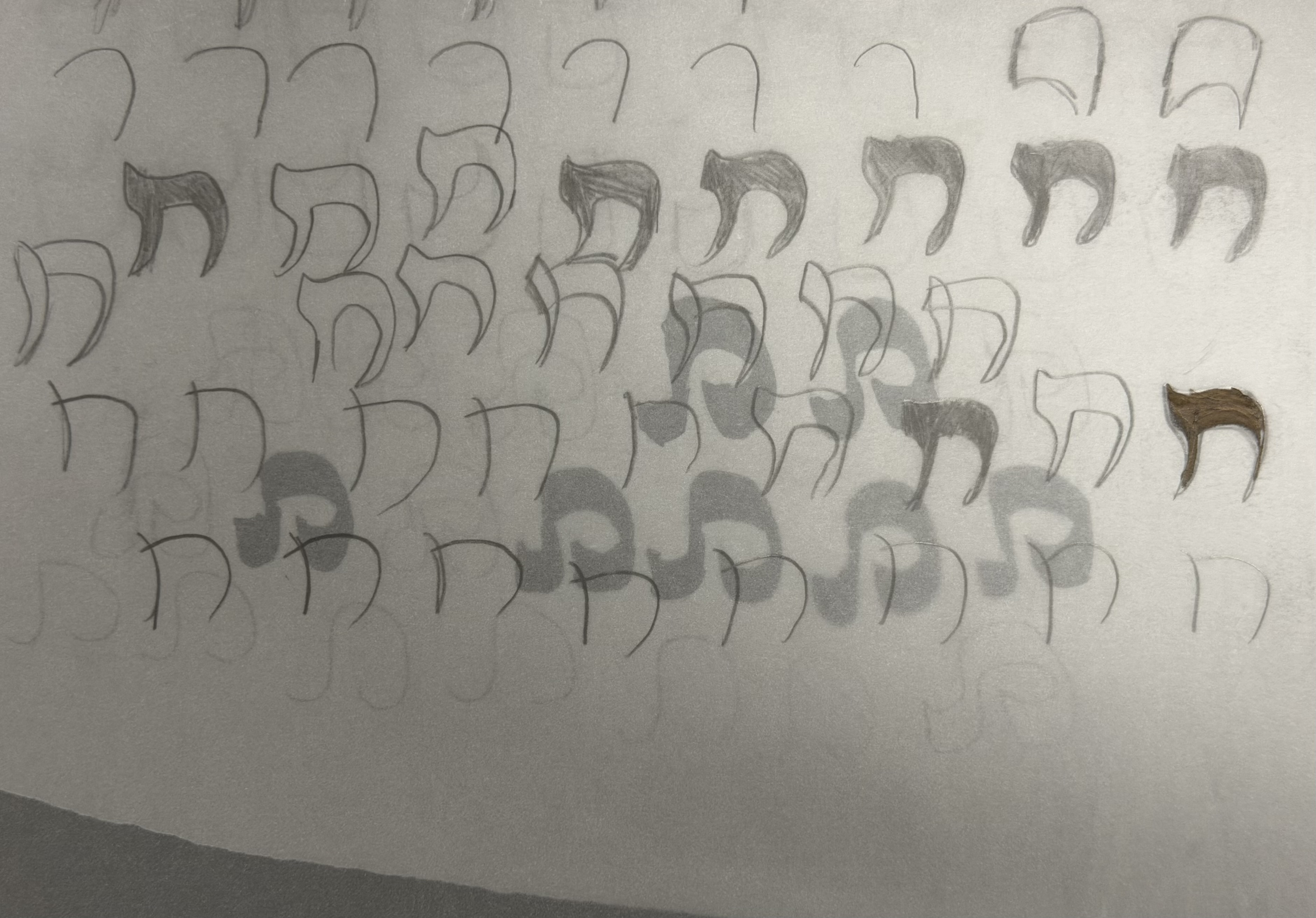
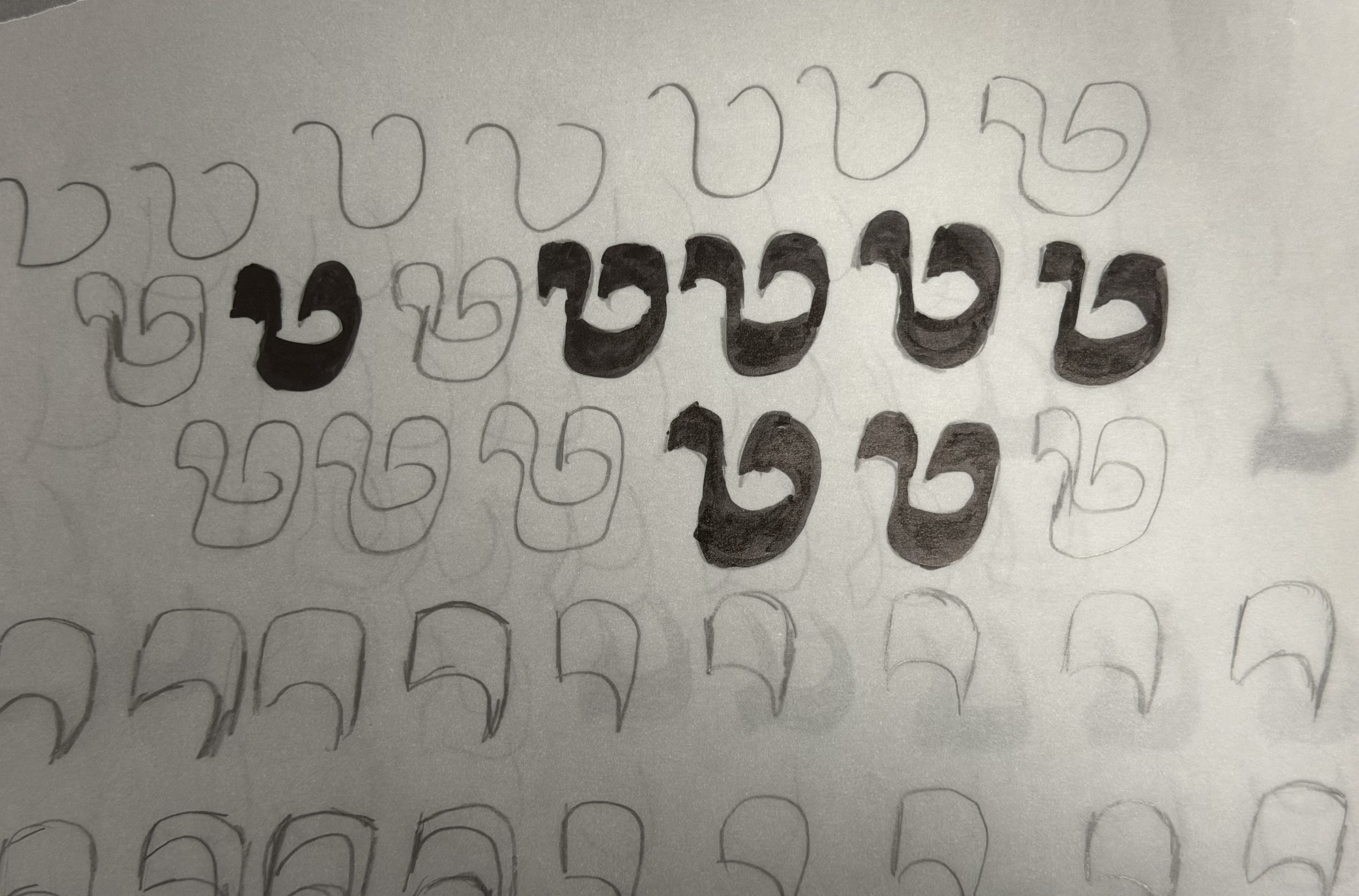
בשלב השלישי הועברו הסקיצות לסביבת העבודה של גליפס, שם תורגמו ממחוות קליגרפיות למערכת טיפוגרפית סדורה.
התהליך כלל זיקוק של הפרופורציות, הקונטרסט, המרווחים והיחסים הפנימיים בין האותיות, תוך שימור המתח
שבין האופי האורגני של הכתב לבין דרישותיה של מערכת עקבית ובעלת היגיון צורני משותף.In the third stage, the sketches were brought into the Glyphs working environment, where they were translated from calligraphic gestures into an ordered typographic system. The process involved refining the proportions, contrast, spacing, and internal relationships between the letters, while preserving the tension between the script's organic character and the demands of a consistent system with a shared formal logic.Nella terza fase, gli schizzi sono stati trasferiti nell'ambiente di lavoro di Glyphs, dove sono stati tradotti da gesti calligrafici a un sistema tipografico ordinato. Il processo ha comportato l'affinamento delle proporzioni, del contrasto, della spaziatura e delle relazioni interne tra le lettere, preservando la tensione tra il carattere organico della scrittura e le esigenze di un sistema coerente e dotato di una logica formale condivisa.
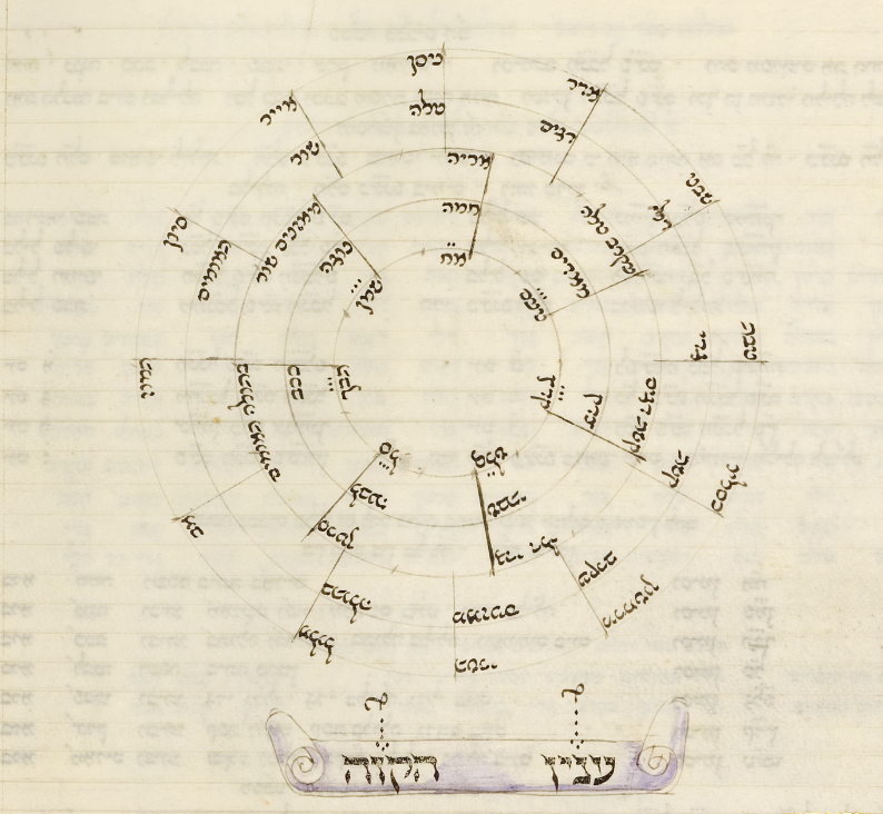
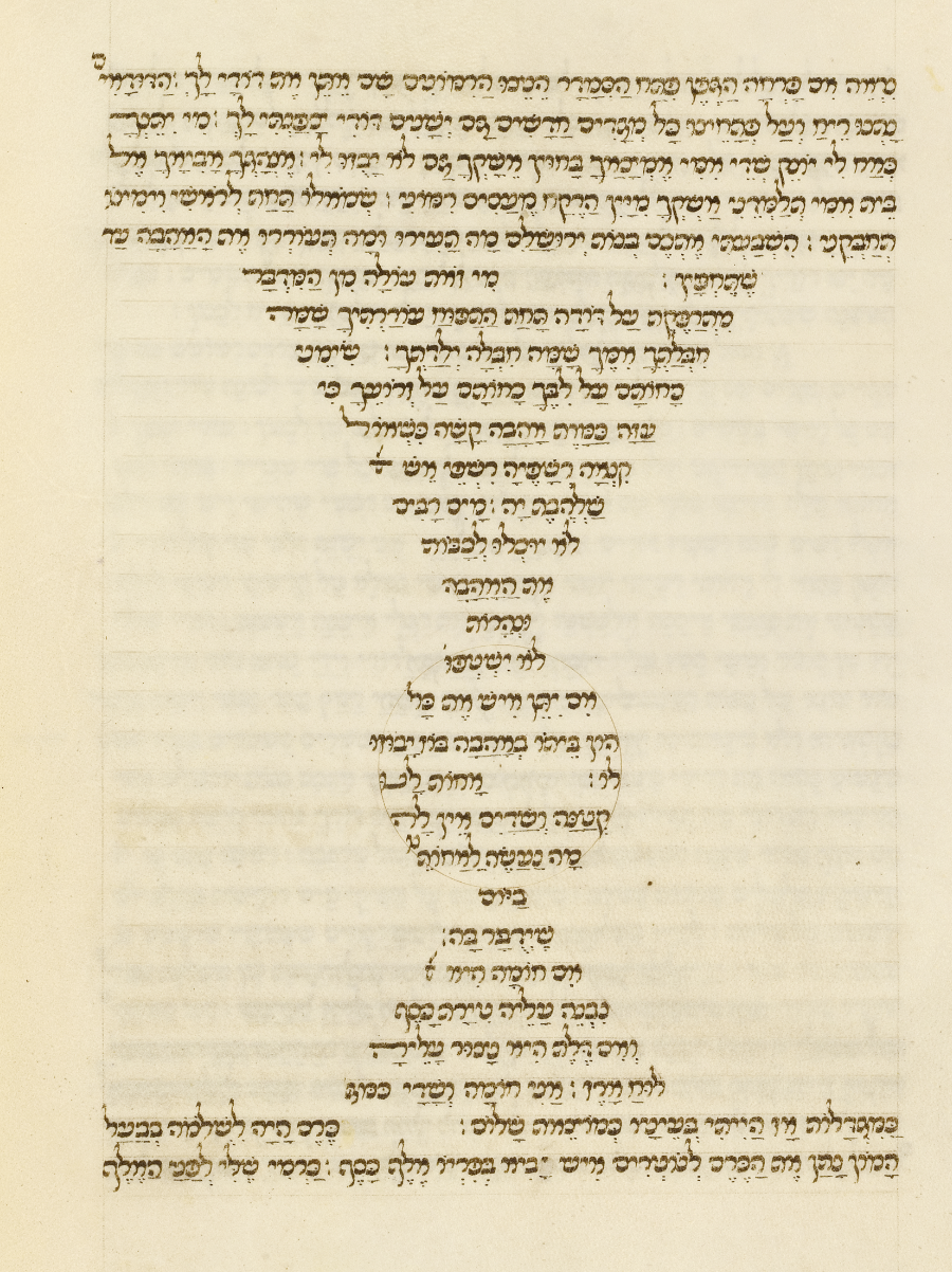
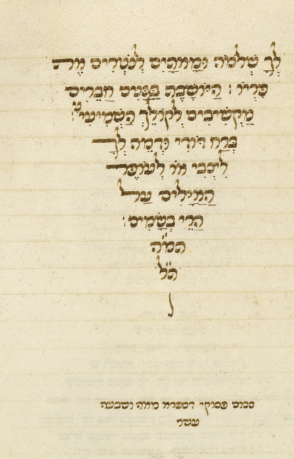
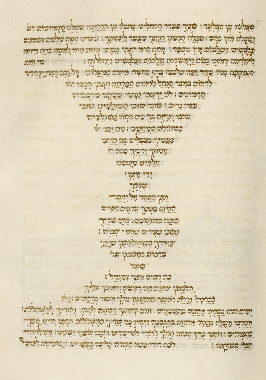
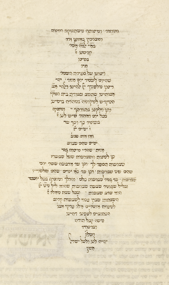
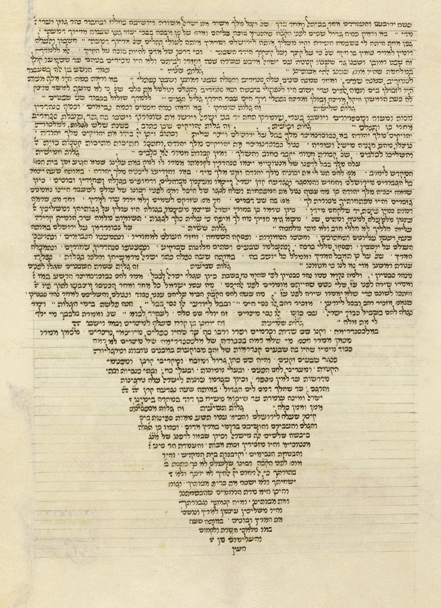
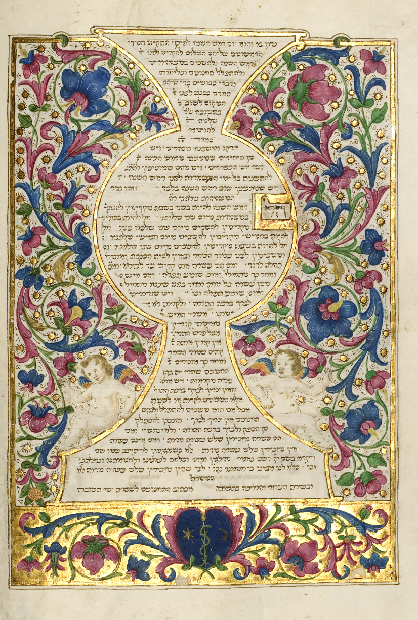
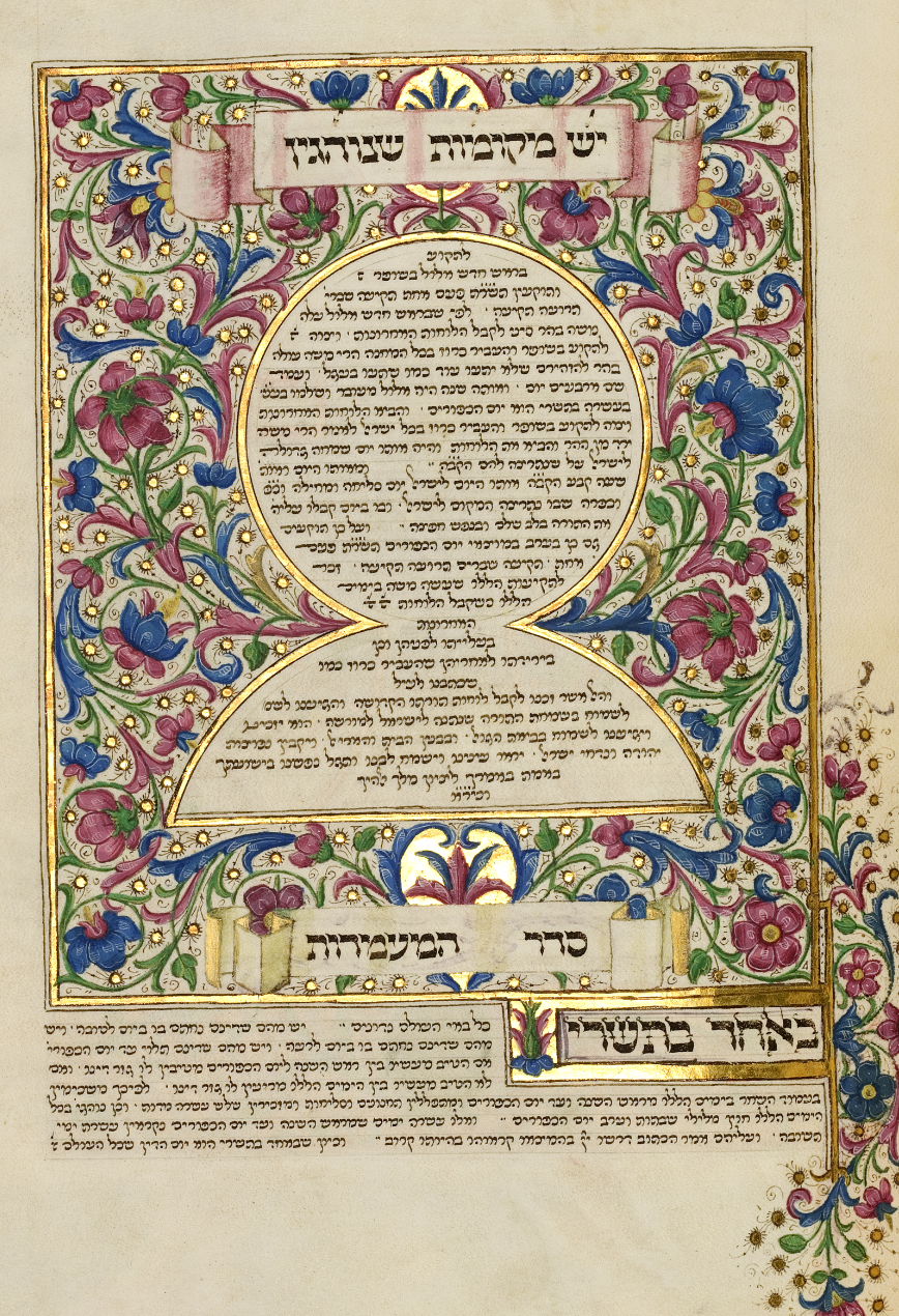
הגריד במחזור רוטשילד מציג שימוש מתוחכם בטקסט צורני, שבו סידור המילים חורג מן
המבנה המלבני המקובל והופך למרכיב חזותי פעיל. תופעה זו מזוהה עם מסורת הקארמינה
פיגוראטה, אך במקרה זה אין מדובר ביצירת דימויים פיגורטיביים, אלא בתבניות גיאומטריות
מופשטות פתרון זה אינו רק אמצעי למילוי חלל עימודי, אלא מערכת ארכיטקטונית של ממש,
שסביבה נבנו בהמשך מסגרות זהב, עיטורים צמחיים וקומפוזיציות מאוירות.The grid in the Rothschild Mahzor shows a sophisticated use of shaped text, in which the arrangement of words departs from the conventional rectangular block and becomes an active visual element. This phenomenon is linked to the tradition of carmina figurata, though here it does not form figurative images but abstract geometric patterns. This solution is not merely a way of filling empty layout space, but a genuine architectural system, around which gold frames, floral ornaments, and illuminated compositions were later built.La griglia del Machazor Rothschild mostra un uso sofisticato del testo figurato, in cui la disposizione delle parole si allontana dal blocco rettangolare convenzionale e diventa un elemento visivo attivo. Questo fenomeno è legato alla tradizione della carmina figurata, sebbene qui non si tratti di creare immagini figurative, bensì motivi geometrici astratti. Questa soluzione non è soltanto un modo per riempire lo spazio impaginativo vuoto, ma un vero e proprio sistema architettonico, attorno al quale furono poi costruite cornici dorate, ornamenti floreali e composizioni miniate.
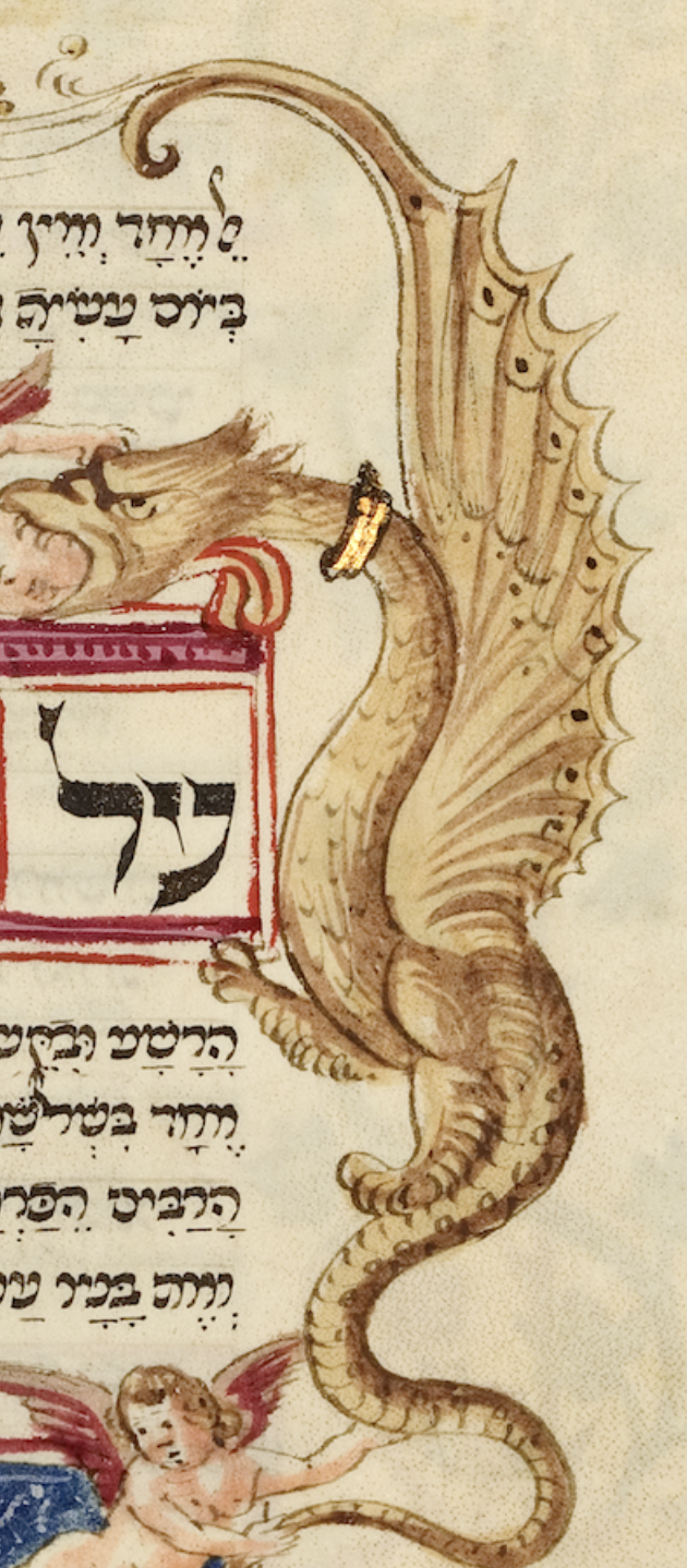
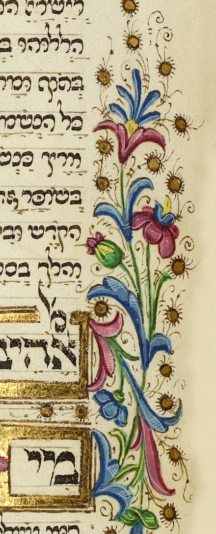
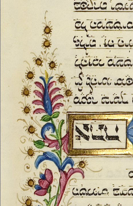
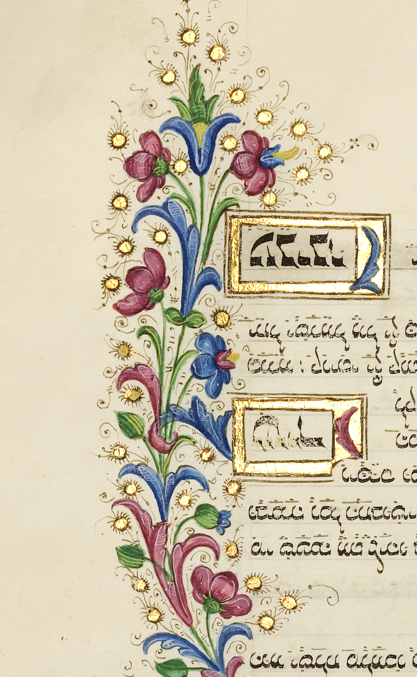
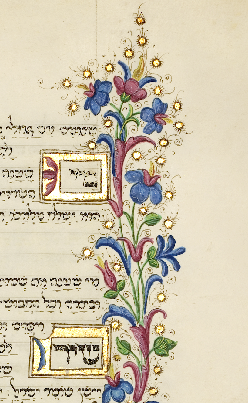
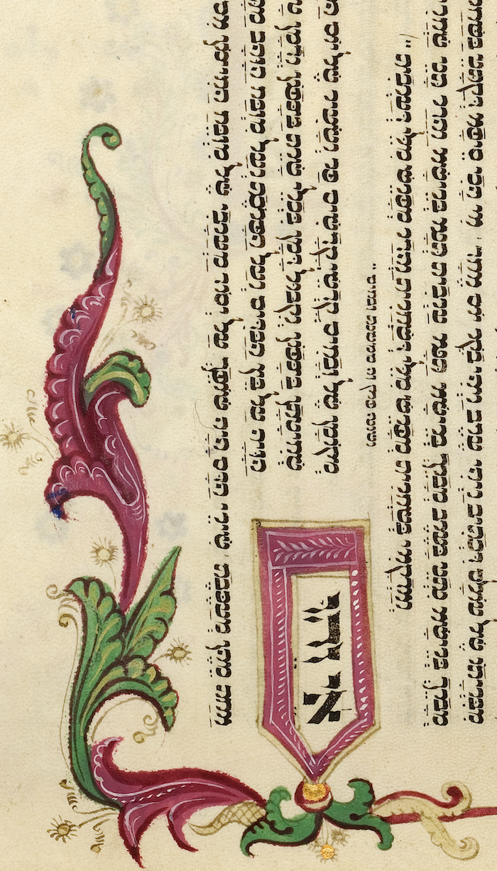
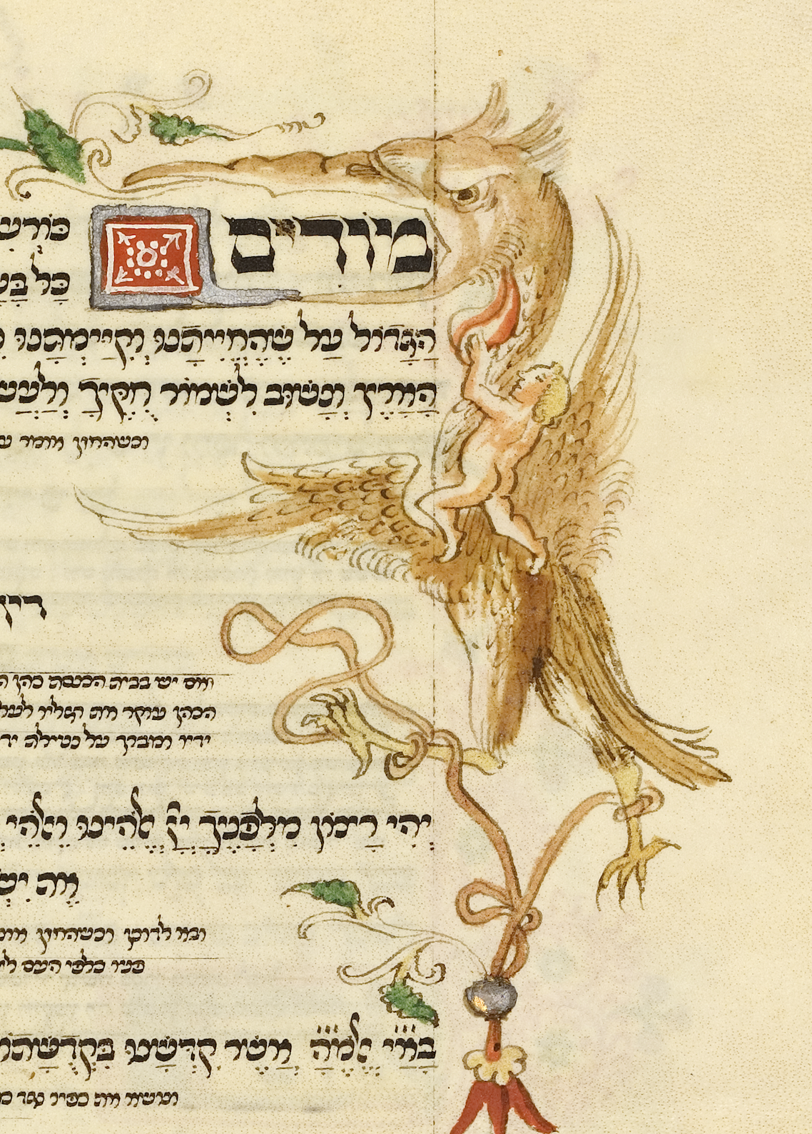
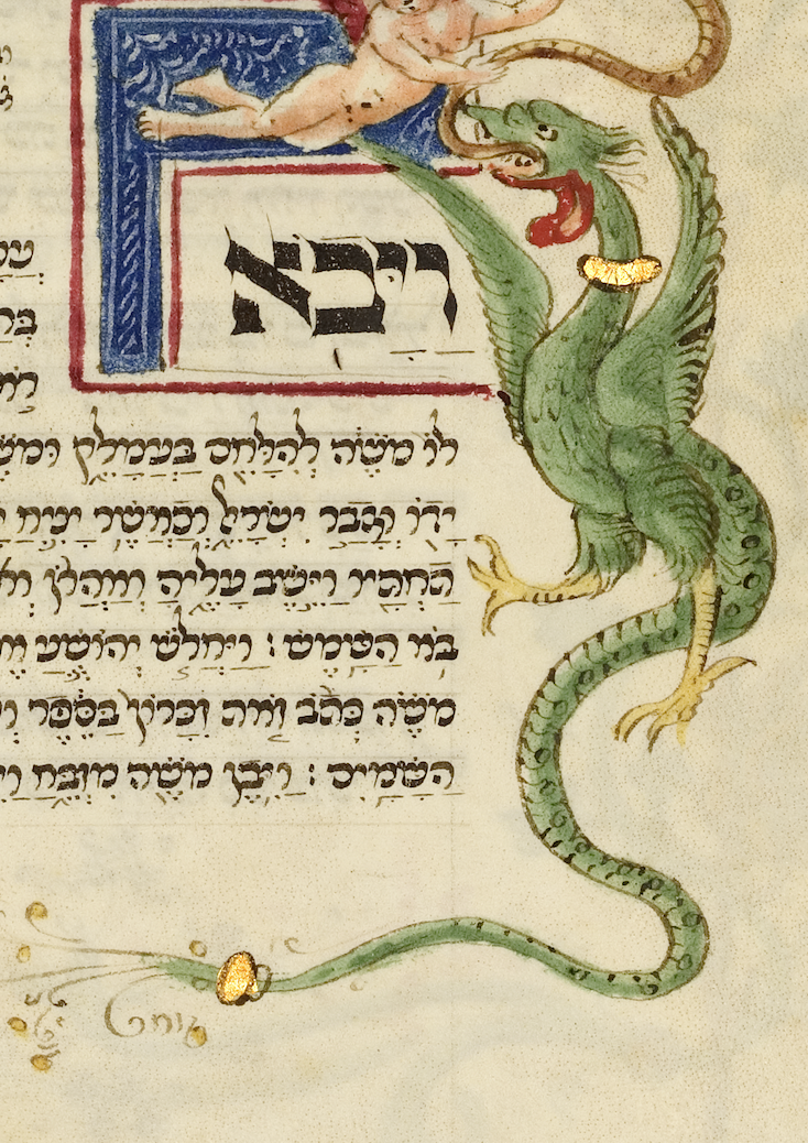
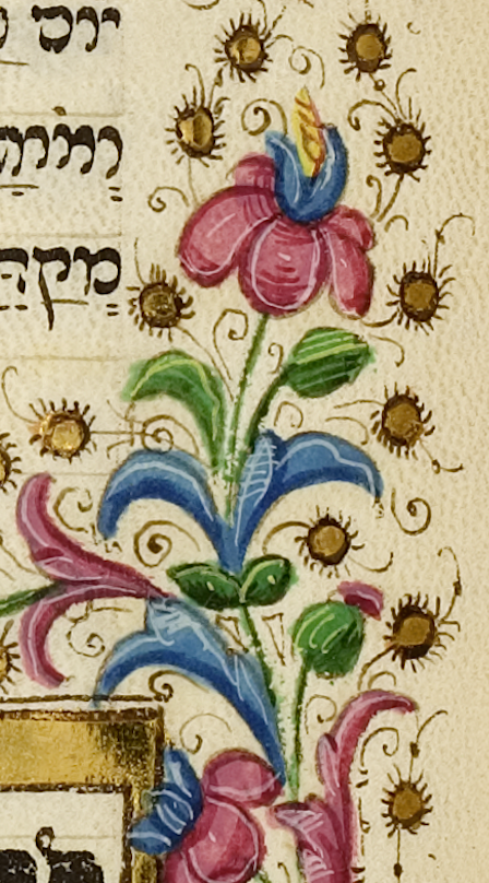
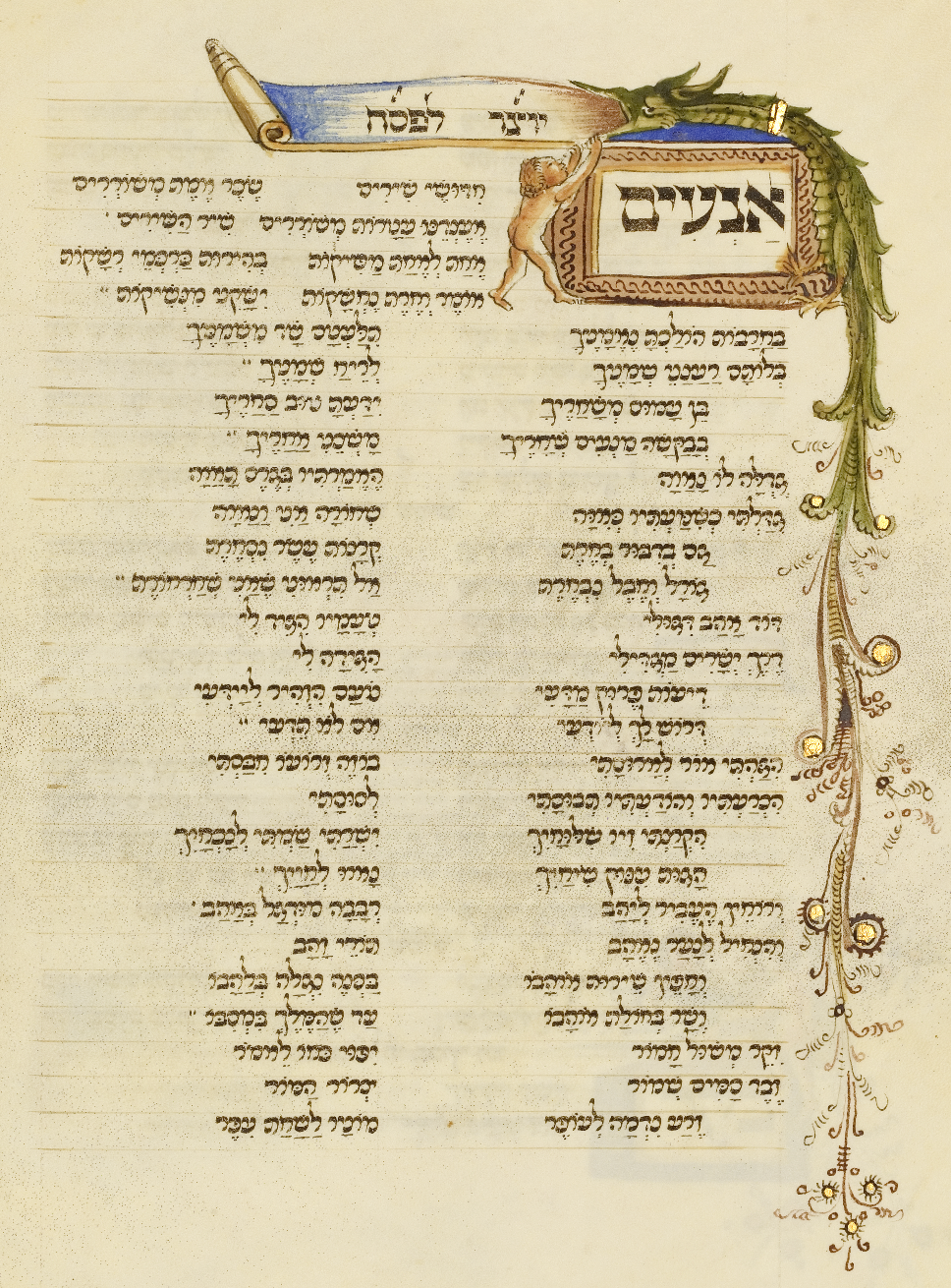
לאחר השלמת הכתיבה עברו דפי הקלף לסדנאות של אמנים נוצרים בפירנצה, שהוסיפו צבעי מים,
טמפרה, עלי זהב, מסגרות פרחוניות ודמויות מלאות תנועה. המחקר מזהה שלוש קבוצות עבודה
שונות: סדנה אחת התמקדה בעיקר בקישוט ולא תמיד הבינה את משמעות הטקסט, סדנה אחרת
תיארה מנהגים יהודיים בדייקנות, ואילו הסדנה היוקרתית ביותר השתמשה בטמפרה ובזהב ויצרה
דמויות בעלות נפח, עומק ותנועה בסגנון הרנסאנס הפלורנטיני.After the writing was completed, the parchment pages passed to the workshops of Christian artists in Florence, who added watercolors, tempera, gold leaf, floral frames, and figures full of movement. The research identifies three distinct working groups: one workshop focused mainly on decoration and did not always grasp the meaning of the text, another depicted Jewish customs with precision, while the most prestigious workshop used tempera and gold to create figures with volume, depth, and movement in the style of the Florentine Renaissance.Dopo il completamento della scrittura, i fogli di pergamena passarono alle botteghe di artisti cristiani a Firenze, che aggiunsero acquerelli, tempera, foglia d'oro, cornici floreali e figure piene di movimento. La ricerca individua tre gruppi di lavoro distinti: una bottega si concentrò principalmente sulla decorazione e non sempre comprese il significato del testo, un'altra raffigurò con precisione usanze ebraiche, mentre la bottega più prestigiosa utilizzò tempera e oro per creare figure dotate di volume, profondità e movimento nello stile del Rinascimento fiorentino.
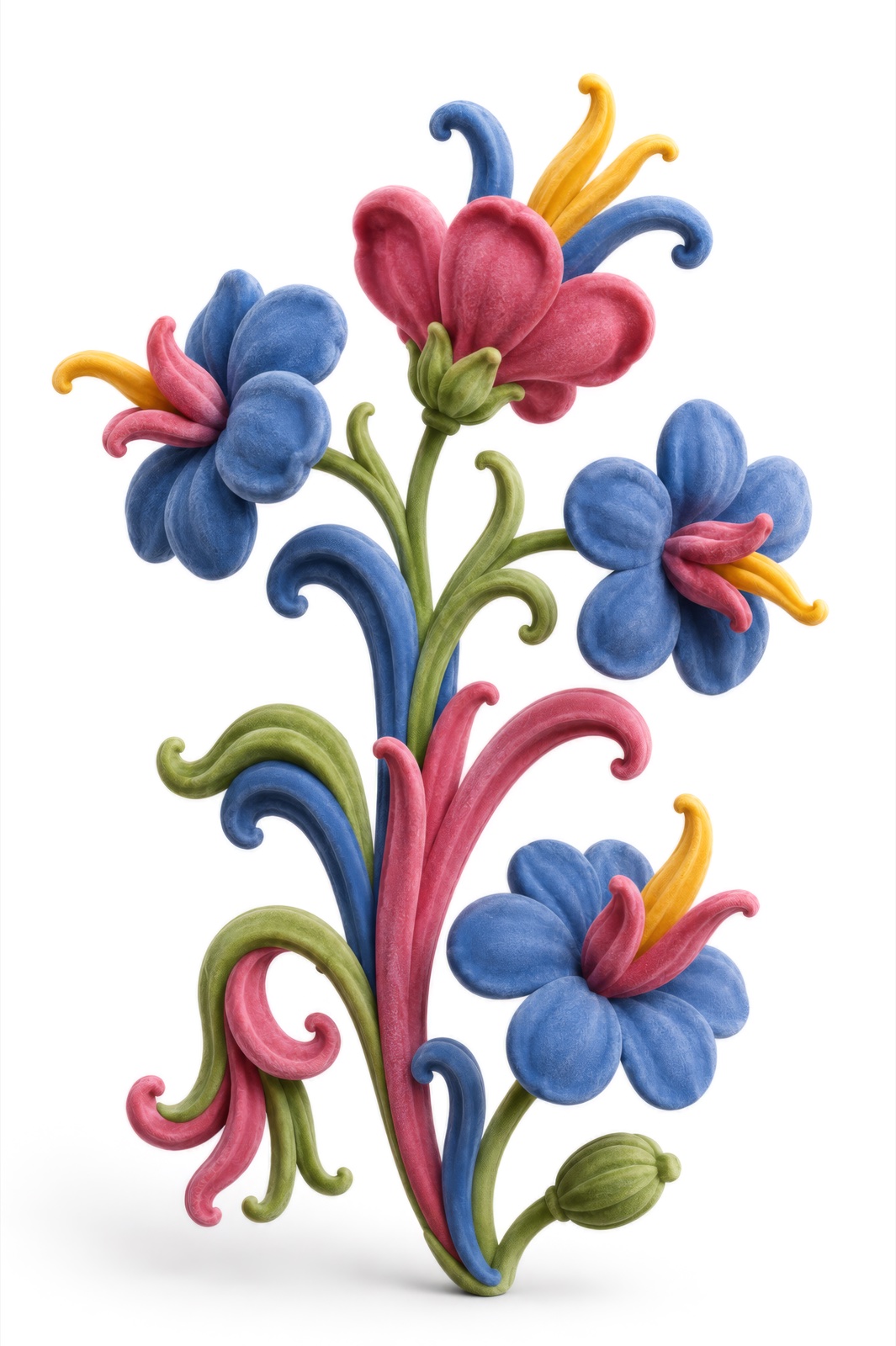

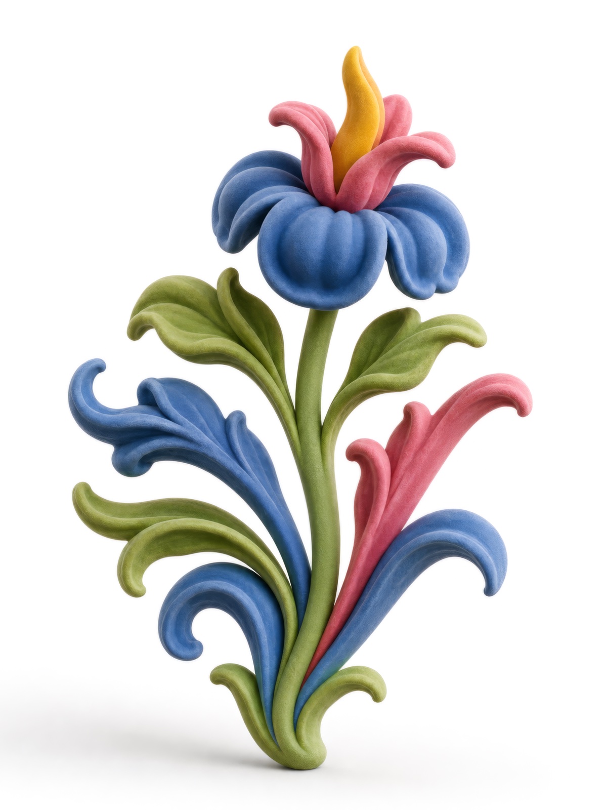
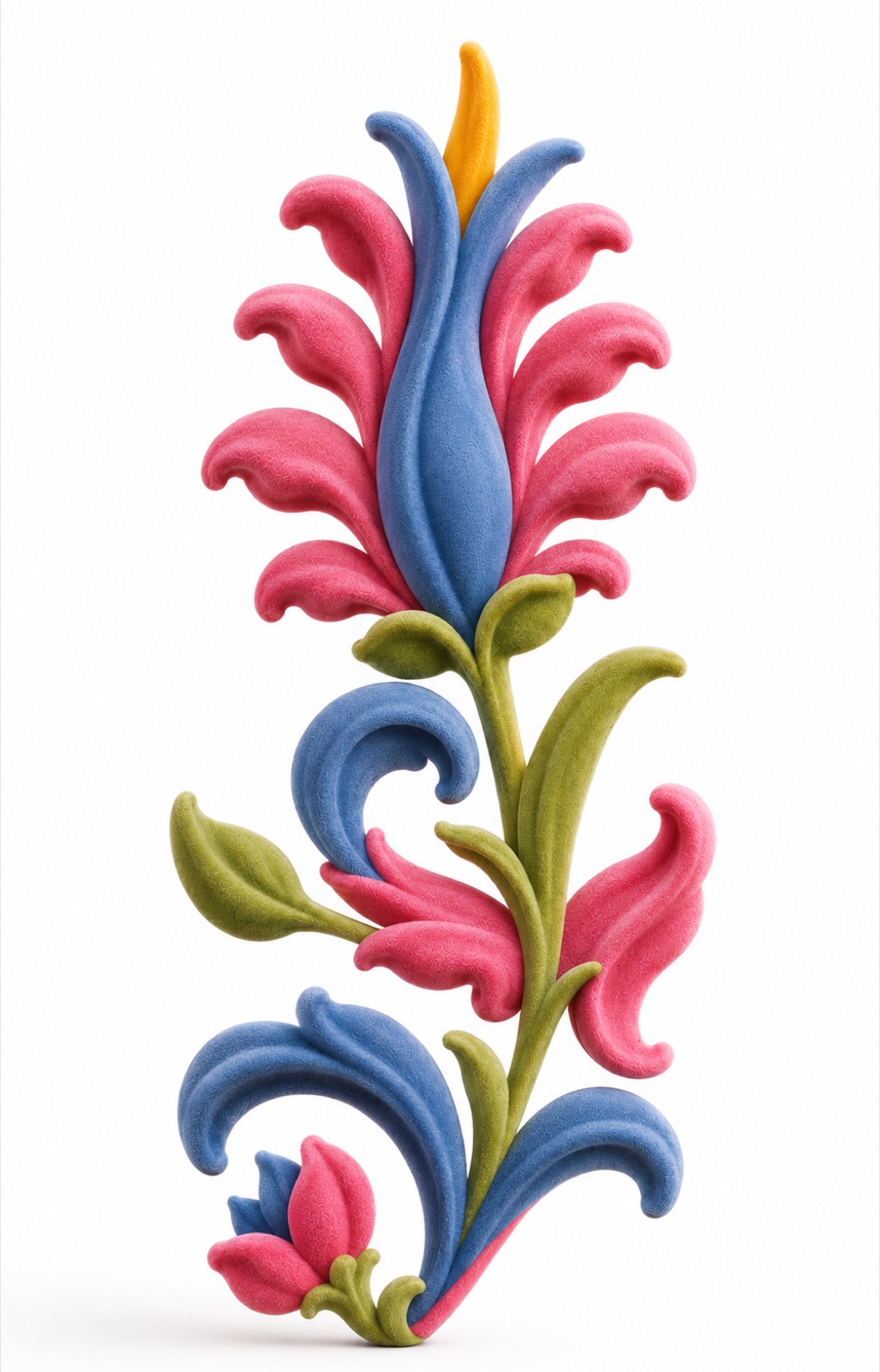
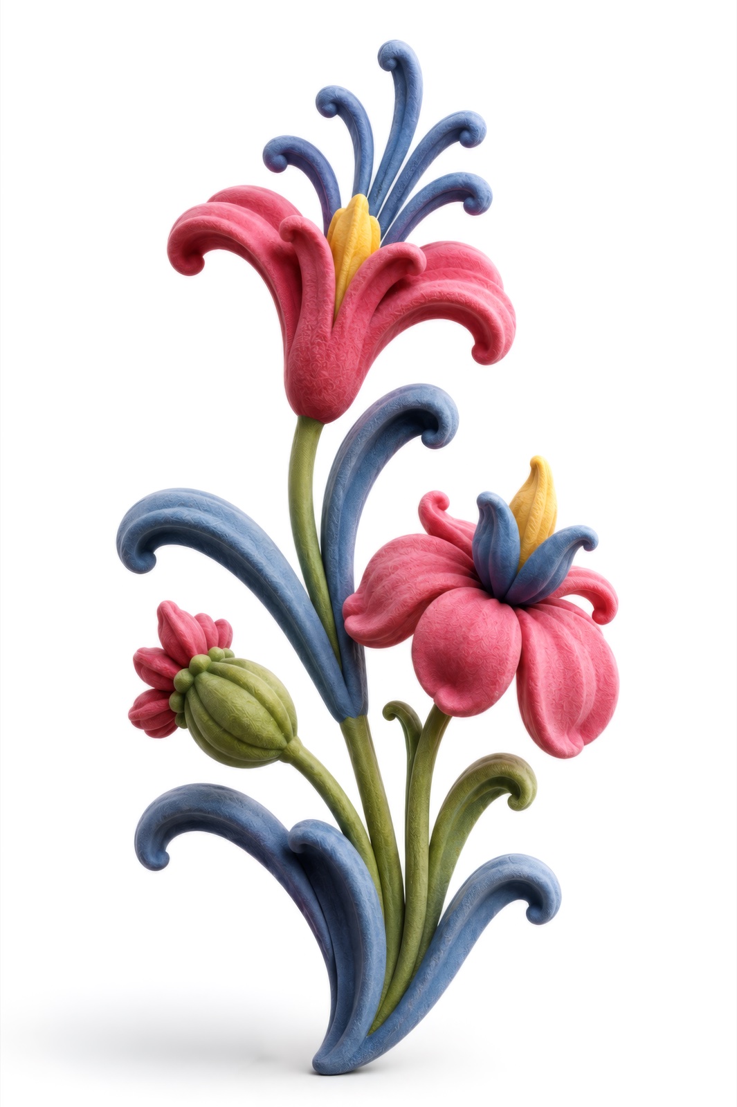
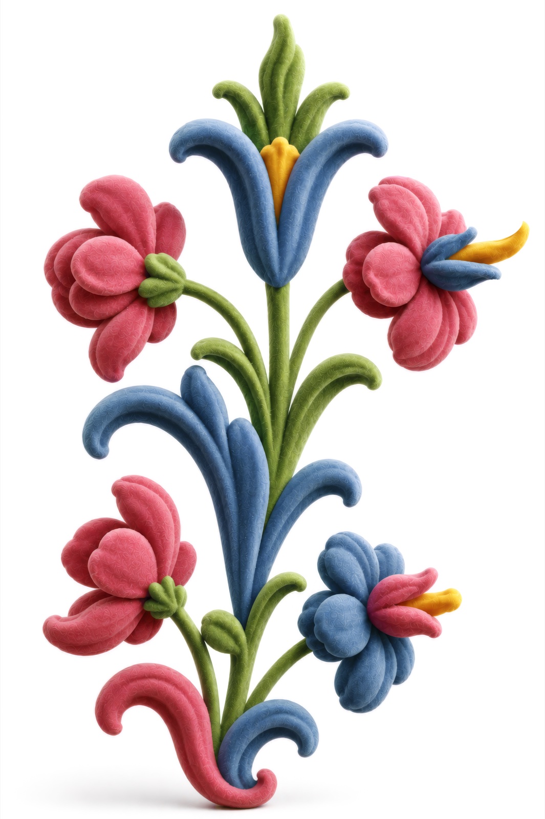
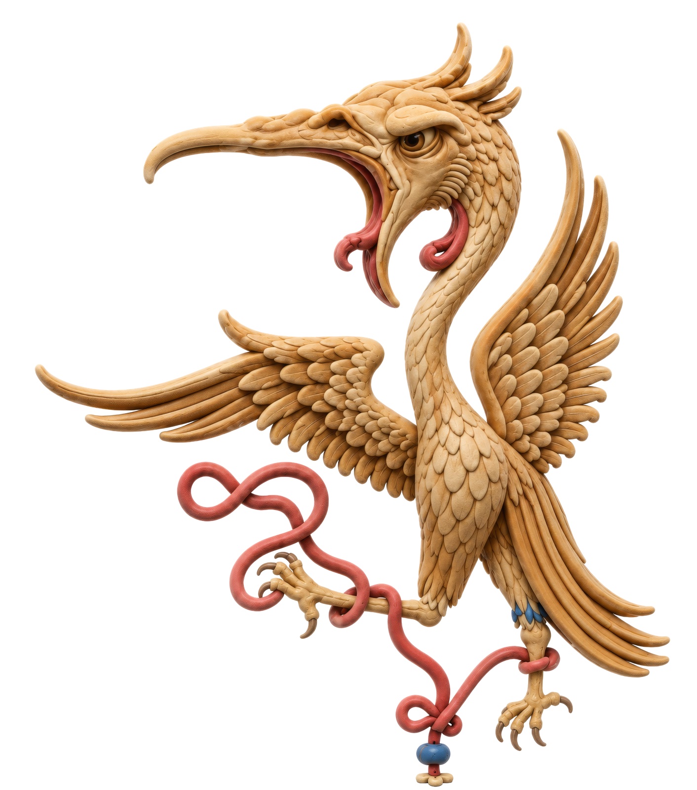
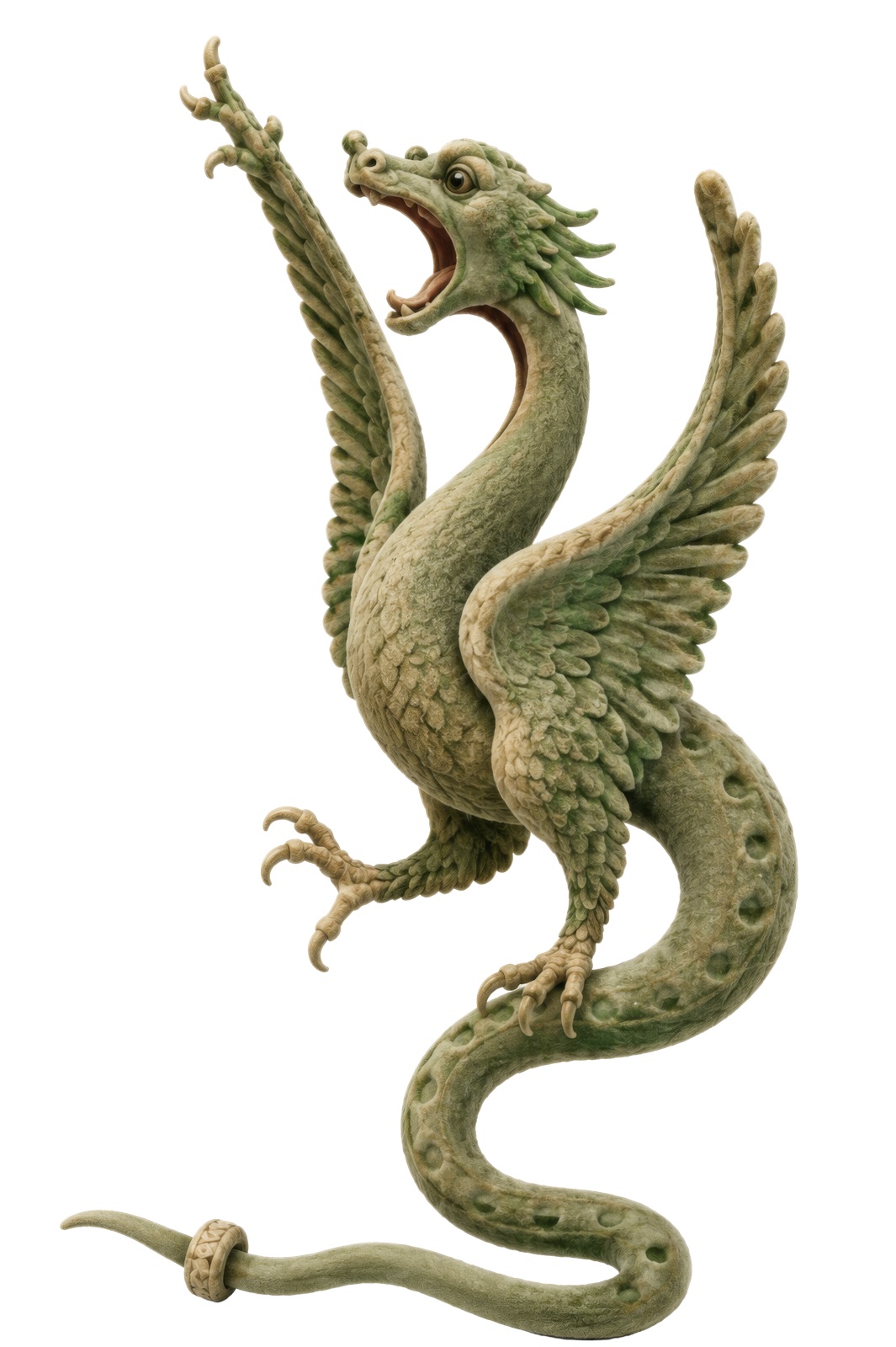
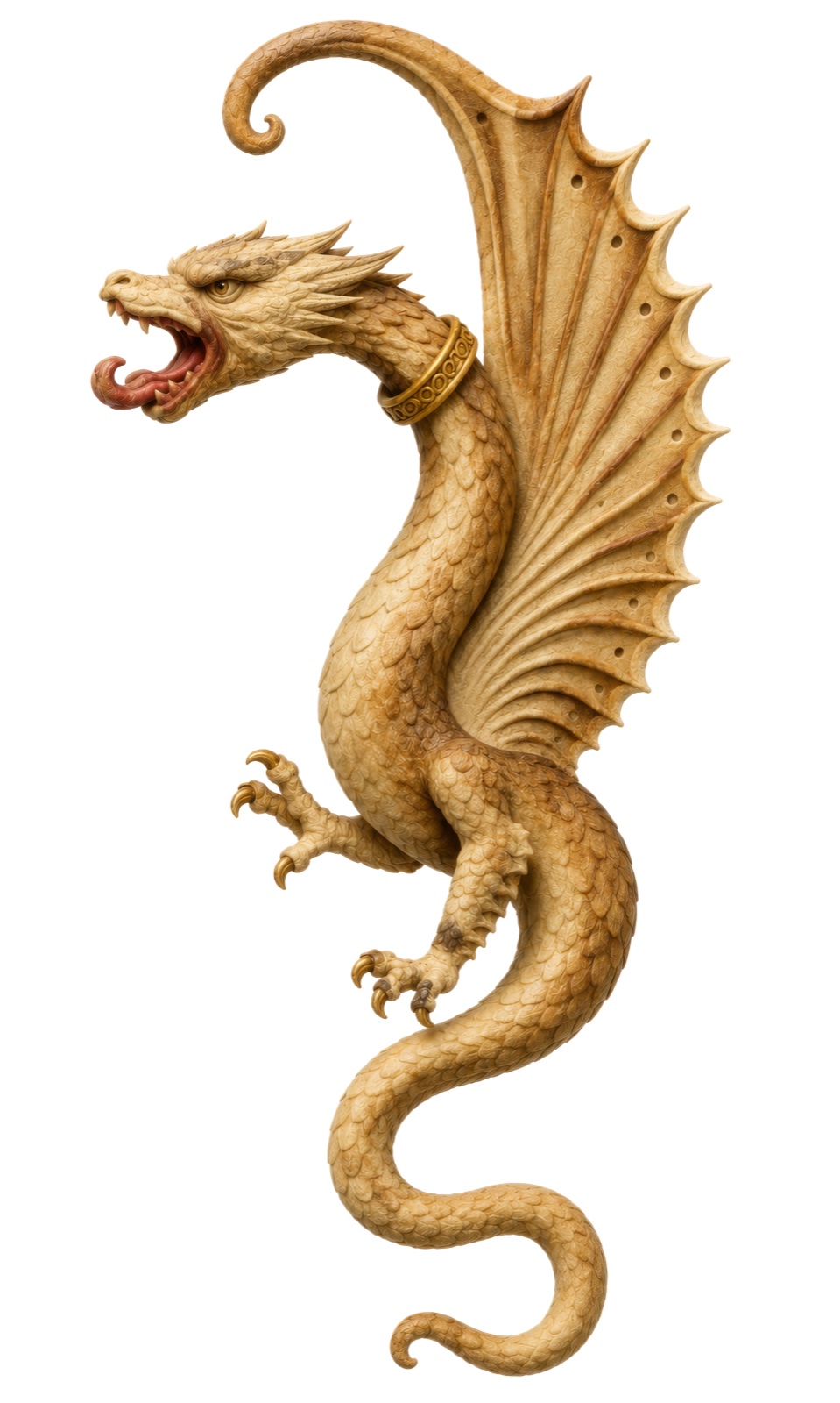
בתהליך השחזור ביקשתי להפיח חיים חדשים באיורים המקוריים של מחזור רוטשילד.
שמרתי על הצבעוניות, הדמויות והשפה החזותית של כתב היד, אך תרגמתי אותם למרחב
תלת ממדי באמצעות נפח, עומק וטקסטורה. בהמשך הנפשתי את האיורים, כך שהדימויים
ההיסטוריים קיבלו תנועה ונוכחות עכשווית, מבלי לאבד את אופיים המקורי.In the reconstruction process, I sought to breathe new life into the original illustrations of the Rothschild Mahzor. I kept the coloring, the figures, and the visual language of the manuscript, but translated them into three-dimensional space through volume, depth, and texture. I then animated the illustrations, so that the historical images gained movement and a contemporary presence, without losing their original character.Nel processo di ricostruzione, ho cercato di infondere nuova vita nelle illustrazioni originali del Machazor Rothschild. Ho mantenuto la cromia, le figure e il linguaggio visivo del manoscritto, ma le ho tradotte in uno spazio tridimensionale attraverso volume, profondità e texture. Ho poi animato le illustrazioni, affinché le immagini storiche acquisissero movimento e una presenza contemporanea, senza perdere il loro carattere originale.
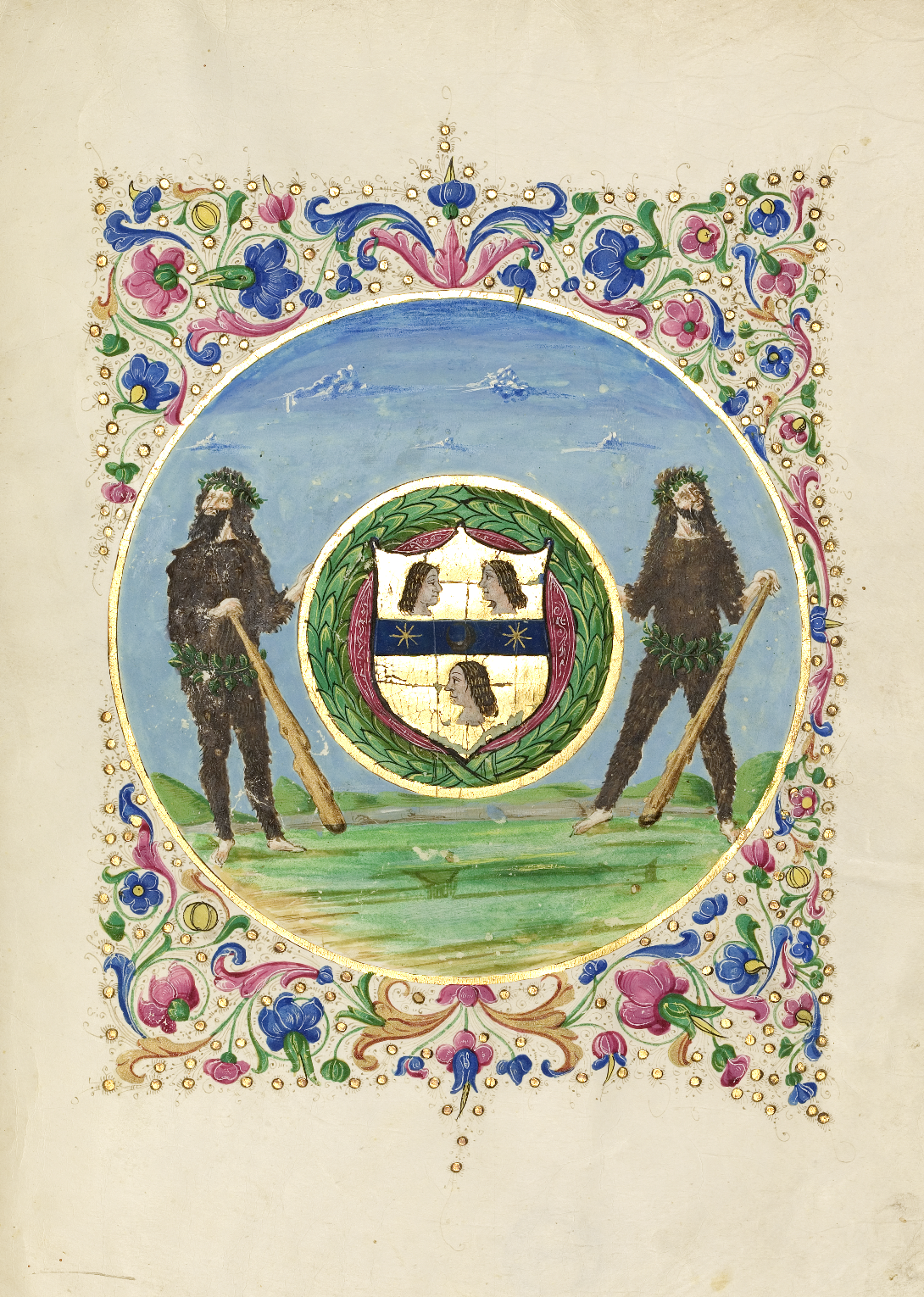
המחזור הוזמן עבור משפחת גאליקו ובהמשך עבר ככל הנראה למשפחת נורסה כמתנת נישואים. סמלי שתי
המשפחות שולבו בעיטורים והפכו את הספר גם לחפץ משפחתי ולסמל מעמד.מאות שנים
לאחר מכן הגיע כתב היד למשפחת רוטשילד. לאחר שעבר בין בני המשפחה
ונשדד בזמן מלחמת העולם השנייה, הוא הוחזר לבעליו. בשנת אלף
תשע מאות שישים ושש נתרם לספריית בית המדרש
לרבנים באמריקה בניו יורק, שם הוא שמור כיום.The mahzor was commissioned for the Galiko family, and later apparently passed to the Norsa family as a wedding gift. The emblems of both families were woven into the ornamentation, turning the book into a family object and a symbol of status. Centuries later, the manuscript reached the Rothschild family. After passing between family members and being looted during the Second World War, it was returned to its owners. In nineteen sixty-six it was donated to the library of the Jewish Theological Seminary of America in New York, where it is kept today.Il machazor fu commissionato per la famiglia Galiko e in seguito passò, a quanto pare, alla famiglia Norsa come dono di nozze. Gli stemmi di entrambe le famiglie furono intrecciati negli ornamenti, trasformando il libro anche in un oggetto di famiglia e in un simbolo di status. Secoli dopo, il manoscritto giunse alla famiglia Rothschild. Dopo essere passato tra i membri della famiglia ed essere stato saccheggiato durante la Seconda guerra mondiale, fu restituito ai suoi proprietari. Nel 1966 fu donato alla biblioteca del Jewish Theological Seminary of America a New York, dove è conservato ancora oggi.
Wachtel, David. "How to Date a Rothschild." Studia Rosenthaliana, vol. 38/39, 2005/2006, pp. 160–168.
Schmelzer, Menahem. "The Liturgy of the Rothschild Mahzor." In Studies in Jewish Bibliography and Medieval Hebrew Poetry: Collected Essays. New York: The Jewish Theological Seminary of America, 2006, pp. 254–259.
Cohen, Evelyn M. "Elia da Vigevano's Prayer Books of 1490." Studia Rosenthaliana, vol. 38/39, 2005/2006, pp. 169–177.
Cohen, Evelyn M., Menahem Schmelzer, and Gerson D. Cohen. The Rothschild Mahzor: Florence, 1490. New York: The Library of The Jewish Theological Seminary of America, 1983.
Busi, Giulio, and Silvana Greco, eds. Il Rinascimento parla ebraico. Cinisello Balsamo: Silvana Editoriale, 2019.
Kogman-Appel, Katrin, and Mati Meyer, eds. Between Judaism and Christianity: Art Historical Essays in Honor of Elisheva Revel-Neher. Leiden and Boston: Brill, 2008.
Cohen, Evelyn M. "A Woman's Hebrew Prayer Book and the Art of Mariano del Buono." In Between Judaism and Christianity, edited by Katrin Kogman-Appel and Mati Meyer, pp. 371–378. Leiden and Boston: Brill, 2008.
Contessa, Andreina. "Jewish Book Collection and Patronage in Renaissance Italy." In Between Judaism and Christianity, pp. 37–58. Leiden and Boston: Brill, 2008.
Contessa, Andreina. "Jewish Book Collection and Patronage in Renaissance Italy." In Il Rinascimento parla ebraico, pp. 158–169. Cinisello Balsamo: Silvana Editoriale, 2019.
Norsa, Paolo. Una famiglia di banchieri: I Norsa, 1350–1950. Napoli: Bollettino dell'Archivio Storico del Banco di Napoli, 1953–1959.
Narkiss, Bezalel. "The Seal of Solomon the Scribe: The Illustrations of the Albenc Pentateuch of 1340." In Between Judaism and Christianity, pp. 319–351. Leiden and Boston: Brill, 2008.
Narkiss, Bezalel. Hebrew Illuminated Manuscripts. Jerusalem: Keter Publishing House, 1969/1978.
Frojmovic, Eva. "Jewish Scribes and Christian Illuminators: Interstitial Encounters and Cultural Negotiation." In Between Judaism and Christianity, pp. 281–305. Leiden and Boston: Brill, 2008.
Halperin, Dalia-Ruth. "The Hidden Couple: An Unexecuted Under-Drawing in the Catalan Micrography Mahzor." In Between Judaism and Christianity, pp. 353–369. Leiden and Boston: Brill, 2008.
The Bezalel Narkiss Index of Jewish Art and Material Culture. Center for Jewish Art, The Hebrew University of Jerusalem. Item: Rothschild Mahzor, Florence, 1490, JTS Ms. 8892.
The Library of The Jewish Theological Seminary of America, New York. Special Collections, MS 8892, Rothschild Mahzor.
Facsimile Editions, London. The Rothschild Miscellany. Companion volume by M. Beit-Arié, L. Mortara Ottolenghi, I. Fishof, et al. London, 1989.
כל התמונות, הצילומים ודימויי כתב היד המוצגים באתר זה (מחזור רוטשילד, JTS Ms. 8892) מובאים באדיבות ספריית בית המדרש לרבנים באמריקה (The Library of The Jewish Theological Seminary – JTS), ניו יורק. זכויות היוצרים והבעלות על הצילומים שמורות לספרייה בלבד. jtsa.eduAll images, photographs, and depictions of the manuscript shown on this site (Rothschild Mahzor, JTS Ms. 8892) are provided courtesy of The Library of The Jewish Theological Seminary of America (JTS), New York. Copyright and ownership of the photographs remain with the library alone. jtsa.eduTutte le immagini, le fotografie e le riproduzioni del manoscritto mostrate su questo sito (Machazor Rothschild, JTS Ms. 8892) sono fornite per gentile concessione di The Library of The Jewish Theological Seminary of America (JTS), New York. I diritti d'autore e la proprietà delle fotografie restano esclusivamente della biblioteca. jtsa.edu